LocalBanana
© 2026 LocalBananaFollow us on X

August 5, 2026·Tutorials·7 min read

Which Aspect Ratio to Use for AI Images

What each ratio is actually for — 9:16, 3:4, 1:1, 16:9, 2:3 — where the subject should sit in each, and the crop losses that come from picking wrong.

Which Aspect Ratio to Use for AI Images

On this page

  • Pick the ratio before you write the prompt
  • What people actually generate
  • 9:16 — phones, stories, short video
  • 4:5 — the feed ratio
  • 3:4 — the default portrait
  • 1:1 — avatars, stickers, grids
  • 16:9 — thumbnails, banners, desktop
  • 2:3 — posters and print
  • 3:2 and 4:3 — wide sets and classic frames
  • The mismatch that costs you the shot
  • How to set it, per engine
  • Wallpapers and posters to start from
  • FAQ
  • What aspect ratio should I use for AI images?
  • What is the best aspect ratio for phone wallpapers?
  • Does --ar 16:9 work outside Midjourney?
  • Can I change the aspect ratio after generating?
  • What aspect ratio works best for multi-panel grids?
On this page
  • Pick the ratio before you write the prompt
  • What people actually generate
  • 9:16 — phones, stories, short video
  • 4:5 — the feed ratio
  • 3:4 — the default portrait
  • 1:1 — avatars, stickers, grids
  • 16:9 — thumbnails, banners, desktop
  • 2:3 — posters and print
  • 3:2 and 4:3 — wide sets and classic frames
  • The mismatch that costs you the shot
  • How to set it, per engine
  • Wallpapers and posters to start from
  • FAQ
  • What aspect ratio should I use for AI images?
  • What is the best aspect ratio for phone wallpapers?
  • Does --ar 16:9 work outside Midjourney?
  • Can I change the aspect ratio after generating?
  • What aspect ratio works best for multi-panel grids?

Pick the ratio before you write the prompt

The aspect ratio is not a framing preference — it decides how much of your image survives contact with the place it is going. A square render on a phone screen loses 44% of its width. A 9:16 render posted as a feed image loses about 30% of its height. Neither is recoverable by cropping cleverly afterwards, because the pixels were never generated.

This guide covers what each ratio is for, which composition it forces, and how to set it correctly on each engine. Every image below is shown at its real ratio, straight from our gallery.

What people actually generate

Across all 9,667 published prompts in our gallery, counted August 2026:

RatioShareCountMostly used for
9:1624.8%2,395Phone wallpapers, stories, short video frames
1:120.7%2,004Avatars, stickers, grids, infographics
3:420.6%1,991Portraits, editorial, product on white
2:313.4%1,292Posters, print, magazine covers
4:57.9%763Feed posts, the tallest most feeds allow
16:97.5%724Thumbnails, banners, desktop wallpapers
3:22.3%227Wide sets, classic 35mm frame
4:31.9%183Slides, older screens, fine art

66.6%

of everything in the library is vertical

9:16, 3:4, 2:3 and 4:5 combined

20.7%

is square

Almost all of it grids, stickers and infographics

12.5%

is landscape

16:9, 3:2, 4:3, 5:4 and 21:9 combined

Two thirds vertical is not an aesthetic trend, it is where the images get looked at. Worth knowing before you default to 16:9 out of habit.

9:16 — phones, stories, short video

The narrowest common ratio and the most used. Its defining constraint is that the top and bottom strips do not belong to you: a status bar, a clock, captions and a row of controls all sit on top of the image. Anything important in those bands gets covered.

So compose in the middle band, and ask for emptiness at the ends explicitly.

Minimalist Phone Wallpaper with Negative Space Gradient

Minimalist Phone Wallpaper with Negative Space Gradient

Nano Banana Pro
Prompt▾
Make a beautiful 9:16 wallpaper. Leave natural negative space near the top and bottom. Give the wallpaper a subtle top to bottom gradient. No blur effects or cropping. Keep the scene simple. Put your subject and style at the end of the prompt.
A wallpaper prompt that requests negative space at the top and bottom by position — exactly the two strips the phone interface will occupy.Open in LocalBanana

The other 9:16 habit worth stealing: place the subject by fraction of the frame rather than saying "centred". A subject filling the middle 60% reads as deliberate; a subject centred at the geometric middle usually reads as an AI default.

Boyfriend POV — A Quiet Gaze

Boyfriend POV — A Quiet Gaze

Nano Banana Pro
Prompt▾
A photorealistic vertical photo (9:16) captured from a boyfriend point of view.

Medium close-up composition,
the subject occupies roughly 60% of the left side of the frame,
with a slightly top-down angle,
as if taken casually by someone sitting across the table.

A light-colored round wooden table edge appears in the lower-left foreground.

The subject is a young Asian woman
with short brown hair and soft bangs.
She wears a black half-zip high-neck fleece sweatshirt,
thick and soft in texture.
A black square patch with white “alo” lettering is clearly visible on her left upper sleeve.

She leans forward naturally,
left elbow resting on the table,
hand supporting her cheek or chin.
She looks directly at the camera with a gentle, relaxed expression.

The background is a busy but blurred coffee shop interior:
industrial exposed ceiling pipes,
track lighting,
a distant service counter with a red menu board,
and softly blurred customers in dark clothing.

Shallow depth of field keeps the subject sharp and the background creamy and soft.

Camera feel:

50mm or 85mm prime lens

Wide aperture (f/1.8 – f/2.0)

Warm indoor lighting

Natural skin tones

Overall mood:
candid, intimate, everyday,
a spontaneous lifestyle moment typical of social media boyfriend POV photography.
The prompt states the subject occupies roughly 60% of the left side of the frame — placement written as a number, not as a mood.Open in LocalBanana

4:5 — the feed ratio

4:5 is the tallest image most social feeds will display without cropping, which makes it the safe choice for anything that needs to be seen in a scroll. It is close enough to 3:4 that the same composition works in both, and it wastes less vertical space than 9:16 when the destination is a feed rather than a full screen.

Full High-End Product Promotional Photo

Full High-End Product Promotional Photo

Nano Banana Pro
Prompt▾
[BRAND NAME] is launching a new functional wellness elixir (e.g., adaptogenic, nootropic, or natural energy drink). As the Creative Director, devise a product name and visualize a complete high-end promotional shot. The aesthetic is "Cosmic Premium"—technological, clean, and sophisticated, like top-tier Apple product photography.

THE PRODUCT: Design a sculptural, multi-layered beverage bottle suspended in the center. The form is engineered and futuristic. The materials are hyper-tactile: bead-blasted titanium details, frosted borosilicate glass, and textured haptic polymer grips.
**Crucial Color Instruction:** The liquid inside must have a distinct, natural color relevant to its invented function (e.g., vibrant turmeric yellow, deep berry red, earthy matcha green, or pale calming blue). The liquid should look real with subtle natural sediment.
**Crucial Graphic Detail:** On the clear glass section of the bottle, apply a layer of subtle, minimalist, technical typography printed in matte white ink. This design should feel utilitarian and futuristic (e.g., small technical specs like 'SPACE GRADE FORMULA', 'BATCH: OZ-9', volume indicators, or coordinate markings), adding a functional aesthetic similar to aerospace labeling, without overwhelming the bottle's clean lines.

THE ENVIRONMENT & LIGHTING: The bottle is in a seamless studio.
**Crucial Background Instruction:** The background must be a solid, clean, very light pastel tone that is specifically chosen to complement the liquid color (e.g., a soft cool mint background for a warm orange liquid, or a pale blush background for a deep green liquid). No gradients. Ultra-soft, diffused studio lighting creates sleek highlights on metal and deep subsurface scattering in the glass and liquid.

PHOTOGRAPHY STYLE: High-resolution 100mm macro lens shot. Shallow depth of field, sharp focus on bottle textures and the printed graphics on the glass, smooth pastel background bokeh. 8k resolve, hyper-realistic textures.

GRAPHIC OVERLAYS: Include subtle dark gray UI elements.
Bottom Left Corner: Very small, minimalist text (like Manrope Regular font) describing the product's name and function in two sentences.
Bottom Right Corner: A small, minimalist dark gray logomark for [BRAND NAME].
Product promo at 4:5 — tall enough to dominate a feed, short enough that nothing gets cropped when it lands there.Open in LocalBanana

3:4 — the default portrait

If a single human being is the subject and you are not sure where the image is going, 3:4 is the answer. It is the classic portrait proportion: enough height for head-to-waist framing with air above the head, not so narrow that the background disappears. A fifth of our library uses it.

Upward Gaze in Minimalist Space

Upward Gaze in Minimalist Space

Nano Banana Pro
Prompt▾
{
"image_type": "photographic portrait",
"style": "studio portrait, cinematic, minimalist",
"composition": {
"orientation": "portrait",
"framing": "full body from extreme high angle",
"subject_position": "centered",
"camera_angle": "top-down (bird’s-eye / overhead)",
"lens_distortion": "strong wide-angle perspective exaggeration",
"negative_space": "extensive surrounding empty space",
"perspective": "dramatic overhead with subject looking up"
},
"subject": {
"count": 1,
"description": "young person with glasses",
"pose": "standing upright, shoulders slightly forward, arms relaxed",
"expression": "soft, introspective, mildly curious",
"gaze": "looking directly up at the camera",
"accessories": [
"round eyeglasses"
],
"clothing": {
"outerwear": "dark brown jacket",
"innerwear": "light-colored knit or textured shirt",
"style": "casual, understated"
}
},
"facial_details": {
"features": "rounded face, soft jawline",
"emotion": "calm, thoughtful",
"eye_emphasis": "enhanced by glasses and upward gaze"
},
"lighting": {
"type": "studio lighting",
"setup": "top-centered soft light with gradual falloff",
"contrast": "low to moderate",
"shadows": "subtle shadows beneath chin and body",
"vignette": "strong radial vignette darkening toward edges"
},
"color": {
"palette": [
"cool gray",
"charcoal",
"muted brown",
"soft beige"
],
"temperature": "cool-neutral",
"saturation": "low",
"mood": "quiet, contemplative"
},
"background": {
"environment": "studio",
"surface": "smooth seamless floor",
"gradient": "radial gradient from light center to dark edges",
"distractions": "none"
},
"technical_details": {
"camera_type": "digital",
"lens": "ultra-wide or fisheye-style wide-angle",
"depth_of_field": "deep (entire subject in focus)",
"sharpness": "high center sharpness with slight edge softness",
"noise": "minimal",
"post_processing": [
"contrast shaping",
"cool color grading",
"vignette enhancement",
"perspective exaggeration"
]
},
"artistic_elements": {
"concept": "isolation and vulnerability through scale and perspective",
"visual_metaphor": "small subject surrounded by vast empty space",
"aesthetic_influences": [
"editorial portrait photography",
"modern studio minimalism",
"cinematic overhead compositions"
]
},
"typography": {
"presence": false
},
"overall_mood": "intimate, introspective, slightly surreal",
"intended_use": [
"editorial portrait",
"conceptual photography reference",
"AI image generation style guide"
]
}
3:4 with extensive negative space declared as its own field — the ratio gives the room, the prompt says what to do with it.Open in LocalBanana

1:1 — avatars, stickers, grids

Square is the one ratio where symmetry is not a liability. A centred subject with balanced margins is what an avatar wants, and a square canvas divides evenly into 2×2 and 3×3, which is why almost every sticker sheet and panel grid in our library is square.

Ultra Clean Calorie Infographic

Ultra Clean Calorie Infographic

Nano Banana Pro
Prompt▾
Ultra-clean top-down (90° flat lay) infographic composition. A perfectly centered white ceramic plate sits on a seamless light background. On the plate: [FOOD], shown in a precise cross-section or layered cutaway, revealing internal ingredients, textures, and structure with extreme clarity. PRIMARY FOCAL POINT (HERO ELEMENT): Above the plate, occupying a large portion of the upper canvas, place an oversized floating infographic bubble displaying: TOTAL CALORIES [XXXX kcal] The calorie bubble is significantly larger than any other element, instantly readable at thumbnail size. Design language: premium editorial infographic, Apple UI × National Geographic food science, extremely clean, structured, and modern. Color palette: natural food colors, monochrome infographic UI, one accent color reserved exclusively for the calorie bubble. Output: 1080×1080, ultra-crisp, social-feed optimized, no watermark.
A perfectly centred flat lay with the headline element stacked above it — a composition that only balances on a square canvas.Open in LocalBanana
Ultra-Realistic Family Fashion Infographic

Ultra-Realistic Family Fashion Infographic

Nano Banana Pro
Prompt▾
Ultra-realistic family fashion infographic photography featuring a Father, Mother, and Daughter in coordinated casual outfits, arranged in a balanced circular exploded composition.
Floating elements organized clockwise around the trio:
• Father: neutral baseball cap, classic wristwatch, cotton crew-neck tee, lightweight casual jacket, tailored denim jeans, leather belt, ankle socks, white sneakers.
• Mother: soft knit hat, minimal gold earrings, relaxed-fit cotton top, cropped denim or linen jacket, high-waist jeans, leather belt, clean sneakers, structured mini handbag.
• Daughter: playful hair accessories, soft cotton tee, light denim jacket, stretch jeans, ankle socks, pastel sneakers, mini backpack.
Each clothing item suspended mid-air with fine dotted guide lines connecting back to each family member.
Minimal editorial labels highlighting fabric, color, and material details (cotton, denim, leather, rubber sole).
Clean studio background with subtle gradient.
Soft diffused lighting for a warm, wholesome mood.
Premium lifestyle editorial styling, ultra-sharp focus, natural skin tones, 8K quality, high-end fashion catalog aesthetic.
Radial exploded layout: elements arranged clockwise around a centre. Square gives every direction the same amount of room.Open in LocalBanana

If you are generating panels, match the grid to the canvas: 1:1 for 2×2 and 3×3, a portrait ratio for 2×3, wide for a storyboard strip. The multi-panel guide covers the prompt structure; the ratio choice is upstream of all of it.

16:9 — thumbnails, banners, desktop

16:9 is the ratio you should reach for least often and the one people reach for first. It is correct for video thumbnails, site headers and desktop wallpapers, and wrong for almost everything else — a portrait at 16:9 is mostly wall.

What it is genuinely good at is horizontal separation: two things side by side, or one long diagonal movement across the frame.

Clean Modern YouTube Thumbnail

Clean Modern YouTube Thumbnail

GPT Image
Prompt▾
A clean modern YouTube thumbnail on a bright white background, split visually between bold text on the left and a cropped presenter on the right. On the left, place a massive stacked headline in heavy black sans-serif uppercase reading CLAUDE DESIGN, aligned top-left across two lines. Below it, add a large rounded rectangular orange banner with a subtle drop shadow containing bold white uppercase text with an orange outline that reads IN 6 MINS. Near the headline, include 2 orange starburst spark shapes, one small beside the text and one much larger in the far right background. In the lower-left quadrant, show a floating app interface mockup for a design tool dashboard with a soft off-white panel, thin borders, rounded corners, and a faint shadow. The interface should have a left sidebar with 4 menu items labeled exactly: "Recent", "Your designs", "Examples", and "Design systems". The main panel header should say "Recent" and contain 3 project cards arranged in a grid, labeled exactly: "Thumio Design System", "Thumio Startup", and "Design System". On the right half, show a cropped photorealistic young adult man from chest up wearing a white turtleneck sweater, with messy light brown hair and light facial hair, positioned close to camera. His face is intentionally obscured by a solid tan rectangle placeholder covering most of the face area. He points with one hand toward the interface panel on the left, finger extended. Use a warm orange and white brand palette, high contrast, minimal clutter, polished creator-economy thumbnail styling, subtle shadows, and a composition designed for tech tutorial content.
Thumbnail logic at 16:9 — headline block on the left, cropped presenter on the right. The ratio is what makes the split possible.Open in LocalBanana
City Ribbon

City Ribbon

Nano Banana Pro
Prompt▾
A silk ribbon unfurls diagonally across the canvas, twisting gently in mid-air. Within the folds of the ribbon exists a miniature sculpted city of [CITY], carved as a 3D bas-relief emerging from woven fabric textures.

Inside the ribbon: Landmarks, streets, and skyline rhythms of [CITY], flowing naturally with the ribbon’s curvature, layered in subtle depth.

Style: Fabric realism fused with sculptural relief. Soft highlights, tactile folds, elegant poster design.

Color palette: Derived from the national flag of [COUNTRY], woven seamlessly into the fabric tones.
View & background: Top-down minimalist layout, off-white museum paper texture, strong negative space.

Typography: Title: “[CITY] UNFOLDED” Refined serif subtitle with poetic geographic language.

Composition rules: All architectural detail remains strictly inside the ribbon shape. Ultra-detailed, HDR, gallery-grade, 8K poster aesthetic.
A single diagonal sweep across a wide frame. The same idea at 9:16 would have nowhere to travel.Open in LocalBanana

2:3 — posters and print

2:3 is the print ratio: it matches 4×6, 12×18 and 24×36 without cropping, so a poster generated at 2:3 goes to a printer untouched. It is also the shape magazine covers use, which is why so many poster prompts read as covers — a title block at the top, subject in the middle, small type at the bottom.

Futuristic Earbuds Ad

Futuristic Earbuds Ad

GPT Image
Prompt▾
Create a high-end futuristic product advertisement poster for Apple Pods Pro 3, styled like a premium tech magazine cover. Vertical composition, clean soft gray studio background with subtle rainbow prism lens flares around the edges. A fashionable young person is centered in the background, face obscured by a simple rectangular blur block, wearing a bright neon-lime knit beanie, wavy shoulder-length pink hair, and a black-and-white zebra striped top. One white wireless earbud is visible in their ear. In the extreme foreground, their hand is extended toward the camera holding an open glossy white charging case, shot with dramatic shallow depth of field and forced perspective so the case dominates the frame. Inside the open case, exactly 2 white earbuds are visible. Add 4 larger floating earbuds around the composition: 2 on the left side and 2 on the right side, softly blurred as if suspended in space. Place huge bold white sans-serif headline text across the top reading AIRPODS. On the upper right, add smaller stacked white sans-serif product text reading Apple Pods Pro 3. On the left middle, add a white feature callout in stacked text: Premium sound and noise cancellation. On the right side, add 2 large numeric feature blocks in white: one reading "30" with smaller text "hours of battery life." beneath it, and one reading "1" with smaller text "year warranty." beneath it. Sleek commercial lighting, glossy reflections on the case, crisp product detail, modern fashion-tech aesthetic, polished Apple-inspired ad design, photorealistic, premium editorial finish.
Vertical ad poster built as a magazine cover: type at the top, subject centred, secondary text at the bottom — the standard 2:3 stack.Open in LocalBanana

3:2 and 4:3 — wide sets and classic frames

3:2 is the 35mm frame — wide enough for a landscape or a character sheet laid out left to right, tighter than 16:9 so subjects stay readable. 4:3 is what slides, older screens and a lot of fine art photography use; it is the calmest of the landscape ratios.

Cat-Eared Student Council Character Reference

Cat-Eared Student Council Character Reference

GPT Image
Prompt▾
{
  "type": "anime character reference sheet",
  "style": "clean polished light novel / visual novel design sheet, white background with pale lavender ornamental border, high-detail cel shading, elegant school-themed layout, soft cool lighting, crisp line art",
  "character": {
    "name": "霧島 澪奈",
    "role": "serious female class committee president with black cat traits",
    "age": "high school student, second year",
    "species traits": [
      "2 black cat ears on top of head with soft inner fur",
      "1 long black cat tail"
    ],
    "appearance": {
      "gender presentation": "female",
      "build": "slender, refined, modestly curvy",
      "height note": "tall for a schoolgirl",
      "hair": {
        "color": "deep blue-black",
        "style": "very long straight hair with slight waves at the ends, center-parted bangs, long sidelocks, half-up back section tied with a ribbon bow"
      },
      "eyes": {
        "color": "golden amber",
        "shape": "sharp but elegant"
      },
      "expression base": "cool, intelligent, reserved"
    },
    "outfit": {
      "count": 9,
      "pieces": [
        "navy school blazer with white piping",
        "white dress shirt",
        "large striped ribbon tie in navy and burgundy",
        "school crest on blazer chest",
        "red armband with white Japanese text indicating committee leader",
        "blue plaid pleated skirt",
        "black semi-sheer tights",
        "black loafers",
        "thin gold-framed glasses"
      ]
    },
    "props": {
      "count": 1,
      "items": [
        "dark school folder or notebook with crest"
      ]
    }
  },
  "layout": {
    "format": "landscape character design board",
    "sections": [
      {
        "title": "プロフィール",
        "position": "left column",
        "count": 1,
        "labels": ["bio text block"]
      },
      {
        "title": "SIDE / BACK",
        "position": "upper center",
        "count": 3,
        "labels": ["front full body", "side full body", "back full body"]
      },
      {
        "title": "表情バリエーション",
        "position": "upper right",
        "count": 8,
        "labels": ["通常(真面目)", "微笑み", "注意・叱責", "驚き", "照れ(目をそらす)", "困り顔", "優しい笑顔", "猫っぽく甘える"]
      },
      {
        "title": "ディテール・アクセサリー",
        "position": "middle right left panel",
        "count": 5,
        "labels": ["委員長の腕章", "校章", "猫モチーフのヘアピン", "リボンタイ", "細フレーム眼鏡"]
      },
      {
        "title": "制服ディテール",
        "position": "middle right right panel",
        "count": 3,
        "labels": ["chest and tie close-up", "waist and blazer trim close-up", "sleeve cuff and buttons close-up"]
      },
      {
        "title": "カラーパレット",
        "position": "lower left",
        "count": 5,
        "labels": ["髪", "瞳", "制服", "アクセント", "肌"]
      },
      {
        "title": "特徴的なポーズ・仕草",
        "position": "lower center",
        "count": 4,
        "labels": ["指示を出す(委員長モード)", "資料を確認する", "考え事をする", "休み時間の素顔(少し気が抜けた瞬間)"]
      },
      {
        "title": "その他設定・ポイント",
        "position": "lower right",
        "count": 2,
        "labels": ["classroom vignette", "moonlit night vignette"]
      }
    ]
  },
  "text blocks": {
    "headline": "霧島 澪奈",
    "subheadline": "学級委員長",
    "quote": "みんなのために、きちんとしなきゃ。それが、私の役目だから。",
    "body text": "dense Japanese profile text with school year, birthday, height, blood type, club or committee, personality notes, likes and dislikes"
  },
  "composition notes": [
    "main full-body figure at left, holding glasses near face and carrying a folder",
    "side and back character turnaround in the center",
    "all portraits and close-ups neatly framed in pale lavender boxes with decorative corner motifs",
    "facial close-ups cropped at shoulders",
    "bottom-right vignette images show the character in a classroom and outdoors at night under a crescent moon",
    "overall palette is navy, black, lavender, white, burgundy, muted gold, and soft skin tones"
  ]
}
A character reference sheet at 3:2 — the extra width is what lets figure and annotations sit side by side.Open in LocalBanana
Black-and-white silhouette behind frosted glass

Black-and-white silhouette behind frosted glass

Nano Banana Pro
Prompt▾
Abstract fine art black and white photography of a human silhouette seen through frosted glass, translucent plastic, or diffused acrylic. She is fully obscured, on her knees, with no facial detail, only a soft shadowed outline. Hands are pressed against the surface, fingers slightly spread, creating subtle depth and emotional tension. Extreme soft focus, heavy diffusion, smooth gradients, and gentle falloff of light. High-key monochrome tones, low contrast, minimal texture. Clean minimalist composition with negative space. Ethereal, surreal, haunting mood. Studio lighting with soft backlight behind the subject, cinematic fine-art photography, conceptual and introspective. Sensual pose. Aspect ratio 4:5
4:3 fine art: a single figure with room on both sides, which is precisely the ratio's temperament.Open in LocalBanana

The mismatch that costs you the shot

Here is a real one from our own library: a prompt that asks for a vertical phone wallpaper, generated at 2:3. It is a lovely image and it does not fit a phone. Filling a 9:16 screen with a 2:3 image crops about 16% of its width, 8% off each side — and the sides are where this composition put half of its subject.

Pony Chinese New Year Celebration

Pony Chinese New Year Celebration

Nano Banana Pro
Prompt▾
A vertical phone wallpaper of a crowded group of cute anthropomorphic horse plush toys stacked inside a festive Chinese archway. Pop Mart blind box style, soft fuzzy fur texture, C4D render. Highly diverse and funny expressions: some winking, laughing out loud with open mouths, shocked face, sleepy face, grumpy face, tongue sticking out, playful smirks. Wide variety of unique accessories and decorations: beanie hats, headphones, party cone hats, traditional Tang dynasty hats, ski goggles, funky star-shaped glasses, thick scarves, bow ties, some holding small lucky coins. Colorful, warm lighting, ultra-detailed, cute and playful vibe --ar 9:16
Asked for as a phone wallpaper, generated at 2:3. On a 9:16 screen it loses roughly 16% of its width — a mismatch nobody notices until it is set as the wallpaper.Open in LocalBanana

The general rule: the ratio you generate should be the ratio of the destination, not the ratio of the subject. What each mismatch costs:

GeneratedDisplayed asLost
1:19:16 phone screen44% of width — or, letterboxed instead, 44% of the screen sits empty
2:39:16 phone screen~16% of width, 8% off each side
9:164:5 feed post~30% of height, top and bottom
16:91:1 thumbnail44% of width
3:416:9 banner~58% of height

Upscaling and outpainting can rescue some of this, but both invent pixels. Generating at the right ratio costs nothing.

How to set it, per engine

There are two dialects, and mixing them is the most common ratio mistake we see in the library.

  • Midjourney uses a flag. 42.2% of the Midjourney prompts in our corpus carry --ar, and only 19 of 4,305 spell out the words "aspect ratio". The flag is the interface.
  • Nano Banana and GPT Image take a sentence or a setting. 7.7% of Nano Banana prompts and 4.9% of GPT Image prompts write "aspect ratio" in words. Outside Midjourney, --ar 9:16 is not a parameter — it is just characters in the prompt that the model may or may not interpret.

That difference has a visible cost: 110 Nano Banana prompts in our library still carry a --ar flag, copied over from a Midjourney prompt, doing nothing. If you are lifting a prompt from Midjourney, strip the flags before running it anywhere else.

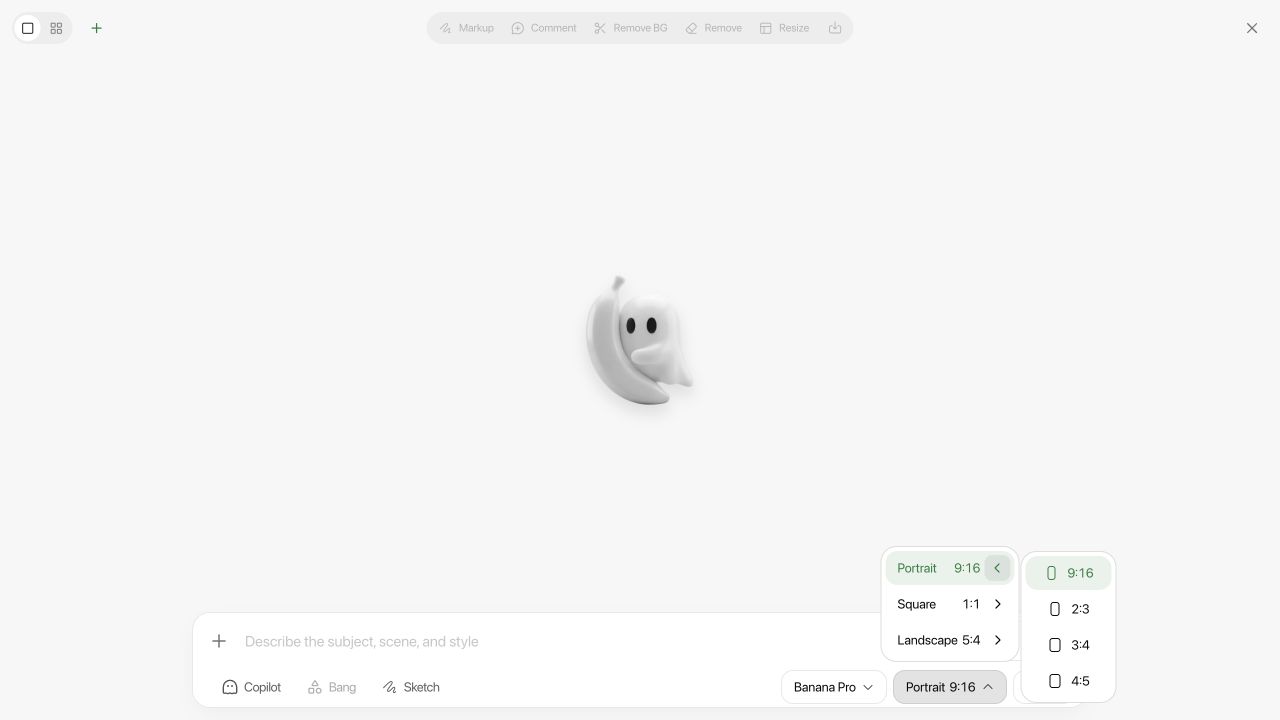
In the generator, the ratio is a picker rather than a prompt word — ten options from 9:16 to 21:9 — which removes the question entirely. Use the picker for the ratio, and use the prompt to say what the ratio is for: where the subject sits, where the empty space goes, what gets cropped if anything must.

[SET RATIO IN THE PICKER: 9:16]

Subject occupies the middle 60% of the frame, feet and head both clear of
the edges. Empty sky in the top fifth and empty floor in the bottom fifth,
both free of detail — those bands sit under the phone interface.
No text, no logo, nothing important within 8% of any edge.

Wallpapers and posters to start from

Spiral Stone Staircase Black Dress Elegant PortraitThrough the Lens, the World Becomes ClearElves in the SnowscapeBrowse all prompts

Every ratio in the table above is browsable in the prompt library, and the corpus-wide numbers behind this page come from our study of 9,667 prompts. If the image also needs to look like a photograph rather than a render, the realism guide is the companion piece; if the same character has to appear across several of them, see the consistency guide.

✕ Bad

cinematic portrait, beautiful lighting, high quality

✓ Good

vertical 9:16 portrait, subject centered in the middle third, clean negative space above and below for mobile UI overlays

FAQ

What aspect ratio should I use for AI images?

Match the destination, not the subject. 9:16 for phone screens and short video, 4:5 for feed posts, 3:4 for portraits, 1:1 for avatars and grids, 16:9 for thumbnails and banners, 2:3 for anything going to print. Two thirds of our library is vertical, which is a fair guide to where images actually get viewed.

What is the best aspect ratio for phone wallpapers?

9:16. Generate at 9:16 and leave the top and bottom fifths visually empty — the clock, status bar and home indicator sit there. A 2:3 image on a 9:16 screen loses about 16% of its width.

Does --ar 16:9 work outside Midjourney?

No. It is a Midjourney flag. On Nano Banana or GPT Image it is just text in the prompt, and it may quietly do nothing — 110 prompts in our own library carry a dead flag copied over from Midjourney. Set the ratio in the picker, or state it in plain words.

Can I change the aspect ratio after generating?

Only by losing pixels or inventing them. Cropping 16:9 down to 1:1 discards 44% of the width; outpainting to widen it makes up the new area. Both are worse than a re-run at the right ratio, which usually costs one generation.

What aspect ratio works best for multi-panel grids?

1:1 for 2×2 and 3×3, a portrait ratio like 3:4 or 4:5 for 2×3 layouts, and 3:2 or 16:9 for a storyboard strip. A mismatched ratio squeezes the panels and is a common cause of dropped detail — the multi-panel guide has the prompt structure.

LocalBanana Team

We run Nano Banana, GPT Image and other models side by side, and publish every prompt in our gallery. These guides are written from that corpus.

Updated August 5, 2026@LocalBanana_io

Try it yourself

Recreate these looks in LocalBanana

Every prompt in this article is ready to run — and there are plenty more in the gallery.

Browse the galleryAll prompts

Related articles

Keeping the Same Character Across AI Generations

Keeping the Same Character Across AI Generations

Tutorials·Aug 5, 2026·8 min read

Multi-Panel AI Images: Comics, Storyboards and Character Sheets

Multi-Panel AI Images: Comics, Storyboards and Character Sheets

Tutorials·Aug 5, 2026·8 min read

Nine AI Image Prompt Patterns That Cover Most Jobs

Nine AI Image Prompt Patterns That Cover Most Jobs

Tutorials·Feb 2, 2026·25 min read