
AI Metal Product Images: Make Reflections Describe the Shape
Read bright and dark reflection bands on a steel carafe, distinguish shine from lost detail, and revise AI product images without changing their design.
On this page
To make polished metal readable, design what it reflects. A broad bright band can describe a curved surface; a controlled dark band can separate its edge. Making the entire product brighter often removes the very contrast that tells us its shape.
This guide is for reviewing or briefing an AI image of a metallic product. The working example is a steel water carafe with a wooden handle. The goal is not maximum shine. It is a recognizable vessel whose surface, rim, and construction remain believable.
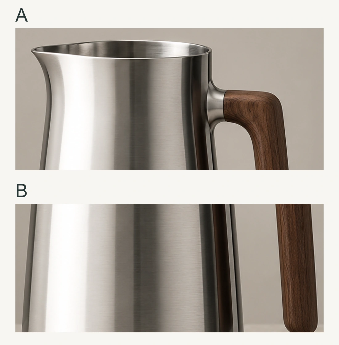
The full scenes below are generated teaching illustrations; the detail study uses actual crops of the first scene. They are not photographs of a tested setup, measured material samples, or a demonstration of any particular model's reliability.
Define the product before directing its light
Our fictional catalog brief is deliberately simple: one open steel carafe, a restrained pouring lip on the left, and one wooden handle attached on the right. The reference shows fine brushing rather than a flawless chrome surface. The complete base, rim, and handle must fit in the image. No text or extra hardware should be invented.
The required result is a legible product on a quiet background. We want to see the body's curvature, distinguish its edge from that background, and understand where the handle joins it. Record those three checks before adding words such as “luxury” or “cinematic.” They remain useful even when a beautiful candidate tempts you to accept a changed silhouette.
Keep a reference, the candidate at full resolution, and a copy viewed at its intended catalog size. Full resolution helps inspect a rim or joint; the smaller view tests whether the product reads clearly in use. A picture that works only when enlarged has not necessarily solved the catalog brief.
This is an image-review exercise, not a promise of accurate material synthesis. The suggested edits below describe visual targets. They do not expose a calibrated light, roughness control, or guarantee of exact preservation in an image generator.
Read the surface as a view of its surroundings
In the carafe, notice the long pale band on the left, the quieter gray through the middle, and the narrow dark region near the handle. Together they describe a round body more clearly than a uniform silver fill would.
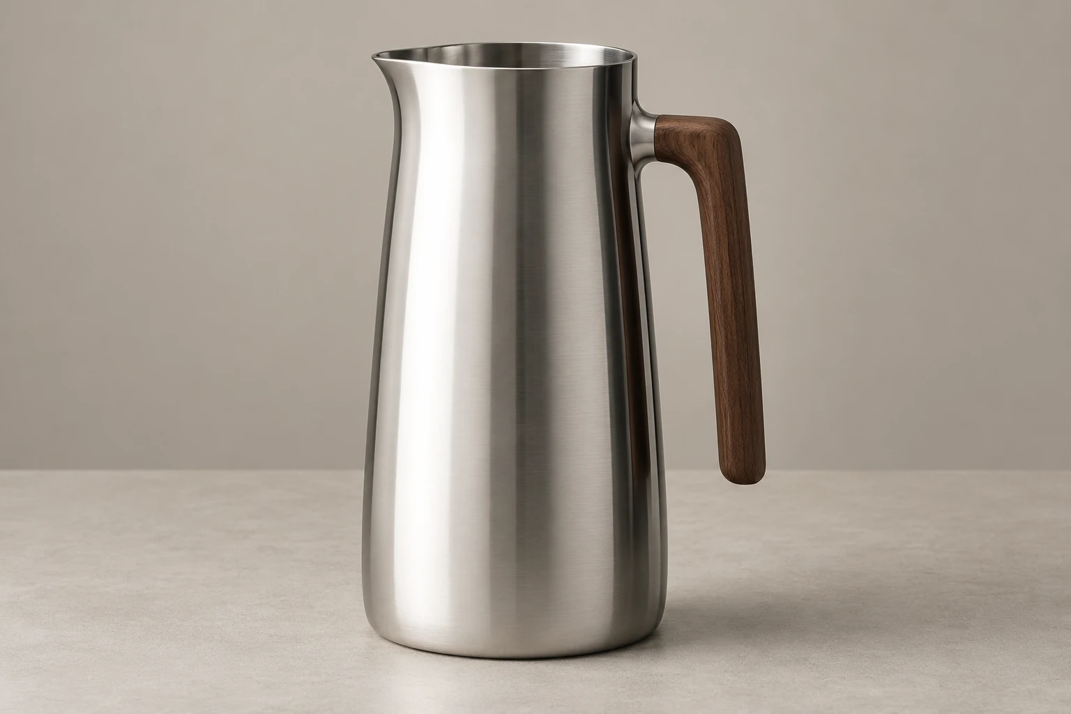
A smooth metallic surface returns light strongly in reflection directions. Changing the environment or the viewing direction can therefore change its appearance dramatically without changing the product. This is different from treating a white object as if it were painted brighter on the side facing a lamp. Adobe's material model distinguishes metallic reflection from the diffuse component common in nonmetals. Adobe: OpenPBR material behavior
Use that distinction as a way to inspect the image, not as a demand that every metal look like chrome. Brushing, oxidation, coatings, contamination, and surface wear matter. Our carafe has a fine directional grain. A painted steel bottle also has a coating whose appearance should not be judged as bare metal.
Ask a concrete question: what visible arrangement of bright and dark surroundings could explain this surface? If every face has an unrelated white streak, the image may be visually busy without communicating one coherent object.
Shape a band instead of adding another lamp
A large white panel is useful because the product can reflect its shape. A black card can create a controlled dark region in that reflected environment. Neither needs to appear in the final crop to influence the visible product. Studio photographer Urs Recher's glossy-bottle demonstration uses a softbox, a gradient, white reflectors, and black paper to separate reflections and describe curvature. broncolor: photographing a glossy object
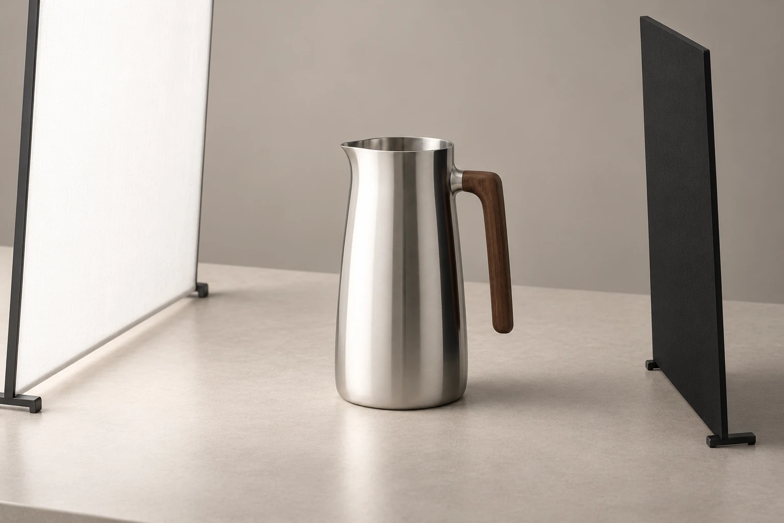
For our carafe, the visual brief can be specific without pretending to calculate the studio:
- A long, broad reflection should follow the left curve from near the rim toward the base.
- A restrained dark band should help separate the right curve from the background.
- Midtone transitions should leave the body round, while the wooden handle keeps its own material character.
These are editorial targets, not physical settings. The size, position, and orientation of an actual modifier would depend on the product and camera. Moving a card can move or reshape its reflection; it is not a universal “make the right side dark” switch.
In an AI brief, “clean studio lighting” alone leaves this arrangement unspecified. “A broad vertical reflection with a gradual gray transition, and a narrow dark edge reflection” gives you more useful features to inspect afterward. It still does not guarantee that the generated geometry or reflections will be correct.
Read the image in three passes
First trace the silhouette without judging the shine. Follow the outside of the base, body, pour lip, rim, and handle. At the handle attachment, check that the connection makes structural sense. A bright interruption there may be a reflection, but an unexplained change of contour needs a separate investigation.
Next follow the large reflection bands. Start near the top of the body and track the broad light area downward. Does it evolve in a way you can read as one curved surface, or break into disconnected patches that obscure it? A real reflection can change shape across a curved vessel; the test is legibility and consistency, not perfect parallel stripes.
Finally inspect surface detail: the fine brushing and small marks. This order matters. Texture can make an implausible shape feel expensive. Conversely, a coherent product should not be rejected simply because a thumbnail cannot resolve every fine grain.
For the shown carafe, the broad light band, middle gray region, and dark edge are the main cues. The brushing supports that reading rather than carrying it. If a revision adds dramatic speckles while leaving the body flat, it has answered the wrong question.
Distinguish a useful highlight from lost information
A highlight can be very bright and still help describe the object. Trouble begins when an important region becomes an undifferentiated patch: the lip disappears into the background, the curvature flattens, or a printed mark becomes unreadable.
Check that region locally. A histogram summarizes the whole image, so a white background can dominate it even when the metal is fine. In a photo editor, a clipping preview and local RGB readouts help locate values at the endpoint of the available range. Clipping can remove image detail; it is not established merely because a region looks shiny. Adobe: image tone and clipping
For a generated, already flattened image, do not assume lowering exposure will reveal a missing rim or label. It may only turn a featureless white patch gray. A small featureless specular glint can be acceptable; a featureless patch over a required product detail is a different decision.
The review question is therefore not “Are there any white pixels?” It is “Did the image preserve the information this product image is meant to deliver?” For the carafe, that includes the rim's thickness, the pour lip, the body's continuous contour, and the handle's attachment.
Use pixel readings to locate a problem, not to certify quality
For an ordinary 8-bit RGB export, a sample of (255, 255, 255) is the maximum value in all three channels. It contains no tonal difference within that one sample. It does not tell you whether a camera overexposed a real object: a generator, white graphic, or later edit could also produce it. Adobe: RGB color values
Imagine three adjacent samples across a required rim detail. In candidate A they read (246,246,246), (250,250,250), and (253,253,253). In candidate B all three read (255,255,255). A contains some variation; B does not distinguish those locations. Neither set alone proves that the rim is correct. Compare the actual edge and the reference, not just the numbers.
If B's flat area has replaced a required seam, reducing brightness cannot infer the seam's original shape. You need an intact source, a deliberate reconstruction, or another result. If the same flat area lies on an unimportant tiny glint, it may not need repair. Read the clipping preview together with the product brief, and check the exported file rather than assuming the editor preview is the final artifact.
Avoid numerical recipes such as “keep every highlight below 245.” Their effect depends on the scene and output; they can turn a lively metal surface into dull gray while preserving a structurally wrong image. The target here is readable information, not a universal histogram shape.
Diagnose the material before changing its texture
If steel looks like white plastic, adding scratches is an unreliable first move. Inspect the larger tonal structure: does the surface contain a readable reflection transition, or only a diffuse-looking pale fill? If it looks like a black void, ask whether the reflected environment is mostly dark rather than immediately declaring the material wrong.
Roughness is also not a single blur filter. It changes the distribution of reflected light; directional microstructure can stretch highlights along a preferred direction. Adobe describes specular roughness and anisotropy as distinct material properties. Adobe: material properties
For this carafe, retain the fine brushed character while repairing a broken reflection band. Do not request “mirror finish” unless the product actually has one. Likewise, a matte ceramic handle should not inherit the steel's reflection simply because the whole object was relit.
Make one revision, then recheck the product
Review the full image first, then the rim, handle, and any branding at a useful enlarged size. Choose the revision from the failed observation:
- Too many scattered bright streaks: simplify the described environment and ask for one dominant continuous band.
- The edge vanishes: adjust the tonal separation between that edge and the background, rather than outlining the whole product in black.
- The body is flat white: request a visible bright-to-gray transition that follows its curvature; recheck whether essential detail returns.
- The light looks good but the vessel changed: return to the reference. Reflection quality does not compensate for a different spout, warped rim, or invented handle joint.
If a product carries text, include a separate content check. Compare the exact lettering and its placement with the reference. Some variation in brightness is a lighting issue; changed letters or a relocated label are fidelity issues. “Preserve the label” is still only an instruction until the result is inspected.
For our first revision, suppose only the middle body is too uniformly bright. Keep the shape, finish, background, and viewing angle fixed in the request; ask for a gradual transition in that region. Afterward, check the silhouette and joints before evaluating the improvement in the band. If either changed, the revision has a tradeoff to repair rather than an unconditional success.
An untested revision template follows. It was not used to produce the illustrations, and it does not guarantee preservation. Use it with an actual reference and remove requirements that do not match the product.
View promptHide prompt
Use the supplied carafe image as the product reference. Preserve the silhouette, open rim, small pouring lip, wooden handle and its attachment, and fine brushed-steel finish. Keep the current framing, viewing angle, background, and shadow direction. Revise only the broad reflection on the body: give it a readable transition from a bright vertical band through middle gray, while retaining a restrained dark reflection near the right contour. Do not convert the finish to mirror chrome, add texture or lettering, close the rim, or redesign the handle. Required product details must remain distinguishable from the background and from reflections.
Keep a short revision record and know when to stop
For each attempt, save the source, state the one allowed change, and write what you observed afterward. For example: “keep the current carafe and wood; change only the central bright region; result has a clearer gray transition, but the upper handle joint moved.” That record describes a partial improvement and a new failure. It prevents the lighting gain from erasing the fidelity problem.
Inspect the same areas after each revision. A may still have the right rim while B has changed the brushing; looking only at the recently edited area would miss that. Crop enlargement is useful here because it directs attention, not because it recovers detail. Return to the whole image before deciding: an attractive isolated band may look pasted on when viewed with the complete vessel.
There is no obligation to keep regenerating until everything becomes shinier. If the original product photograph contains reliable construction and a new result repeatedly changes it, preserve that source and reconsider the scope of the edit. If the candidate already communicates the material, silhouette, and required markings at the intended use size, stop polishing incidental glints. A completed product image meets its brief; it does not maximize every possible visual effect.
Practice: choose the correction before requesting it
Compare the carafe at final-use size, then enlarge the problem area. The following candidates are fictional review situations; they are not additional generated results.
Candidate A: the body looks metallic and the bands read well, but the pour lip has become a second handle. This is a product-identity failure. Return to the correct reference and repair the structure. A darker reflection will not fix it.
Candidate B: the shape and brushing match, but a broad white patch crosses the entire rim and removes the visible boundary between its front and back. Investigate the local file and reference. Ask for the required rim information to remain visible; do not merely darken the whole image and call the issue solved.
Candidate C: the broad bands are coherent, all joints are intact, and a tiny specular point reaches white on the far rim. At catalog size, the rim remains clearly readable. There may be nothing to fix. Avoid turning every bright pixel into a failure when the actual brief has passed.
Candidate D: the reference has a matte wooden handle with visible grain, but the candidate replaces that finish with a uniform mirrorlike strip and loses the grain. The handle no longer matches the reference. Wood can also show sharp specular reflections, so a white strip alone does not prove that it became metal; compare the grain, roughness, and color as well. Preserve the successful steel body and restore the specified handle finish instead of regenerating the entire lighting design.
Write one sentence for each candidate: what failed, what should remain fixed, and what evidence would count as a repair. If all four answers are “more realistic lighting,” repeat the three-pass reading. They are four different problems, and a useful revision should identify which one it is solving.
The product-shadow guide covers how the vessel meets the table. The image-editing guide covers preservation limits when revising an existing image. Once the object is grounded and its construction is intact, use its reflections to explain the surface rather than to overwhelm it.