AI Image Typography: Editable Text and Multilingual Layouts
Build an editable botanical poster, plan natural line breaks, adapt each language, and check text against the image at the final display size.
On this page
Treat the image and the message as two editable parts. Use AI imagery for the scene, then typeset the approved wording in a layout tool. This lets you correct a date, translate a title, or make a phone version without rebuilding the picture.
The difficult part is often not spelling. It is making a beautiful image carry the right information at the size someone will actually see. A title can be perfectly spelled and still disappear into foliage. A readable English layout can collapse when its Chinese counterpart has different line breaks.
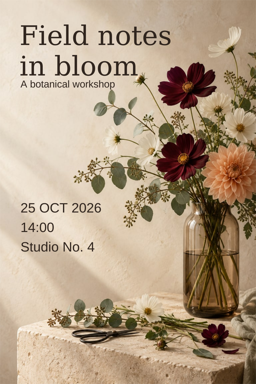
We will use a fictional botanical workshop called Field notes in bloom. The photograph-like scene was generated for this guide; its typography was added separately. The event details are invented teaching copy, not an event announcement. The downloadable SVGs preserve editable text and an embedded raster image.
Prepare a small, complete brief
Start with the unlettered source image, one of the editable posters below, and the four pieces of copy in the next table. You do not need to regenerate the picture to follow the lesson. Keep the source image, editable master and exported preview as separate files.
We want two deliverables: a portrait poster that can be shared as an image, and a web presentation whose important details remain ordinary text. Their acceptance criteria differ. The poster must preserve its arrangement when flattened. The web version must remain understandable when its image is unavailable or its text wraps onto more lines. One export cannot automatically satisfy both jobs.
Before editing, write down the intended display width, required language and longest approved venue name. If those are unknown, make a provisional version and label the assumption. Our example uses English and Chinese; it does not demonstrate every script or promise that a single template will work unchanged everywhere.
Decide what someone must read first
Before choosing a typeface, write the message as ordinary text. Our example contains four roles:
| Role | English example | What it must do |
|---|---|---|
| Title | Field notes in bloom | Identify the event |
| Description | A botanical workshop | Explain what it is |
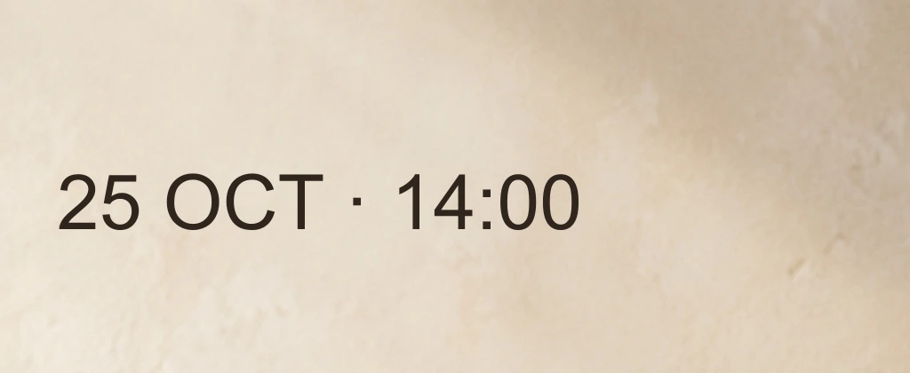
| Time | 25 October 2026 · 14:00 | Allow a practical decision |
| Place | Studio No. 4 | Give the location |
These roles need different emphasis. In this design, the title is largest; the description and practical details are smaller but still readable. That is an editorial choice for this brief, not a universal formula. A ticket with an urgent start time might need another hierarchy.
Keep the approved wording in a text document. Check the date, address and punctuation there before polishing the poster. If the real venue requires a longer address, use that address during layout—not a shorter placeholder that makes the design look easier than it is.
Separate facts from flexible expression. The workshop's time must survive every revision unchanged. The title's line break can move. The English date is spelled out in the copy sheet even though the poster abbreviates October. That makes the intended date clear before a designer chooses a shorter display form. Do not shorten a venue until it becomes a different place, or translate a proper name without an approved equivalent.
Give text a region, not a promise of “negative space”
Our source image has a vase and flowers toward the right and a quieter wall toward the upper left. That leaves a useful region for the title. “Quiet” does not mean pure white: the wall has texture, but fewer competing edges than the flowers.
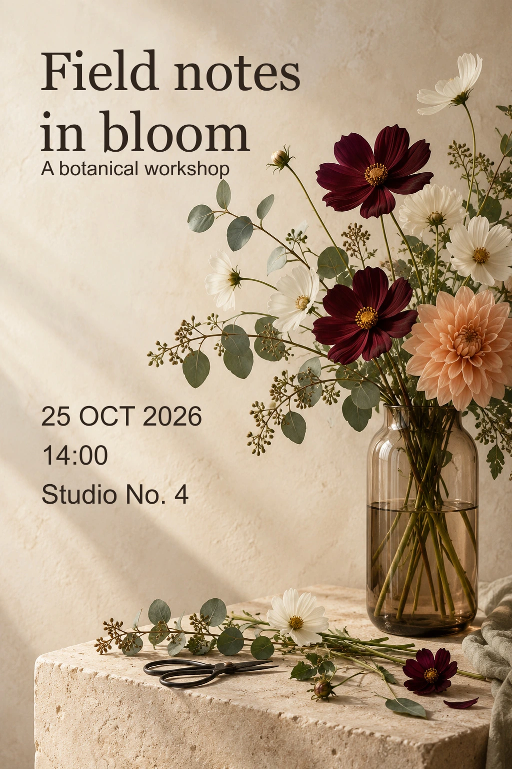
Set a text frame inside the image boundary, with enough room for the actual words. Keep it clear of the vase, the most intricate petals and any planned crop. This layout margin is your chosen breathing room; it is not print bleed or a platform's guaranteed safe area. For print production, use the separate bleed and trim guide.
If a format change cuts into the frame, make a second composition. Sliding the title a few pixels will not rescue every crop. The aspect-ratio guide explains why changing the shape changes the available space.
Keep wording editable and line breaks deliberate
In a layout editor, use actual text objects. A short title may use manual line breaks; longer explanatory copy usually benefits from a text frame that wraps. Adobe distinguishes point type, which expands as you type, from area type, which flows inside a boundary. That distinction is useful when deciding whether a title should keep a designed break or reflow after a revision. Adobe: adding and managing text
Read each line as a phrase. In our title, “Field notes” and “in bloom” belong together as two units. Breaks that strand a preposition or split a date can force the reader to reconstruct the message. Adjust the frame, font size or wording with the copy owner; do not squeeze letter widths until the text happens to fit.
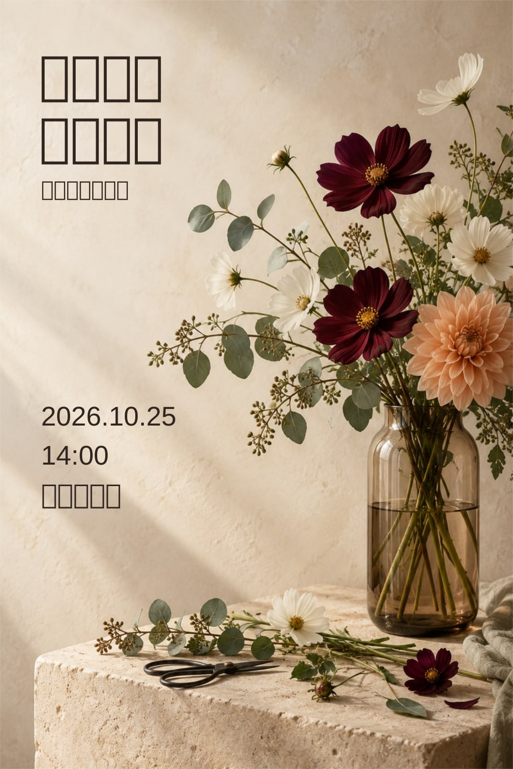
Download the English editable poster and Chinese editable poster. The SVGs contain an embedded image and separate text elements, not outlined letter shapes. Open them in an editor that supports SVG text and change “Studio No. 4.” Font substitution can change line length, so check the result after reopening. No font files are bundled.
Work through the first edit
- Duplicate the master. Open it as an editable document, rather than placing it into another document as one flattened image.
- Select the venue with a text-editing tool. If the entire rectangle selects, inspect whether you are selecting a group, an imported image or an actual text object. Do not assume a bounding box proves editability.
- Replace the venue with “Riverside Botanical Centre · Studio No. 4.” This is a deliberately longer fictional requirement. Keep the time and title unchanged.
- Inspect the whole line. If it runs into stems or beyond the chosen text region, the edit is factually correct but the layout is unfinished.
The original English venue is represented by this element; it is an example from the supplied file, not a complete SVG:
<text x="82" y="1006" font-family="Arial, sans-serif"
      font-size="54" fill="#30251e">Studio No. 4</text>
The words are still characters. Replacing them changes this text object without repainting the source photograph. A text editor can make the replacement, but a visual editor is more convenient for checking fit. The coordinates and size describe this specific 1024 × 1536 layout; they are not recommended values for every poster.
A useful repair order is to allow a second line, adjust the text region, then revisit size and spacing. For this venue, try breaking after “Botanical,” keeping “Centre · Studio No. 4” together. If neither line fits comfortably beside the image, put the complete practical information in a separate, quiet area. Reducing everything until it becomes tiny merely moves the failure to the reader.
Keep the title and body styles distinct while making that repair. Enlarging the venue to match the title would solve one small-text problem by erasing the hierarchy. The goal is a legible practical detail that belongs to the composition.
Translate the layout as well as the words
The Chinese title in this example is “花开时的田野笔记,” with the description “植物花艺工作坊.” The roles remain the same, but the line lengths and rhythm differ. We rearranged the title into two natural phrases and set its spacing for those glyphs rather than copying the English break positions.
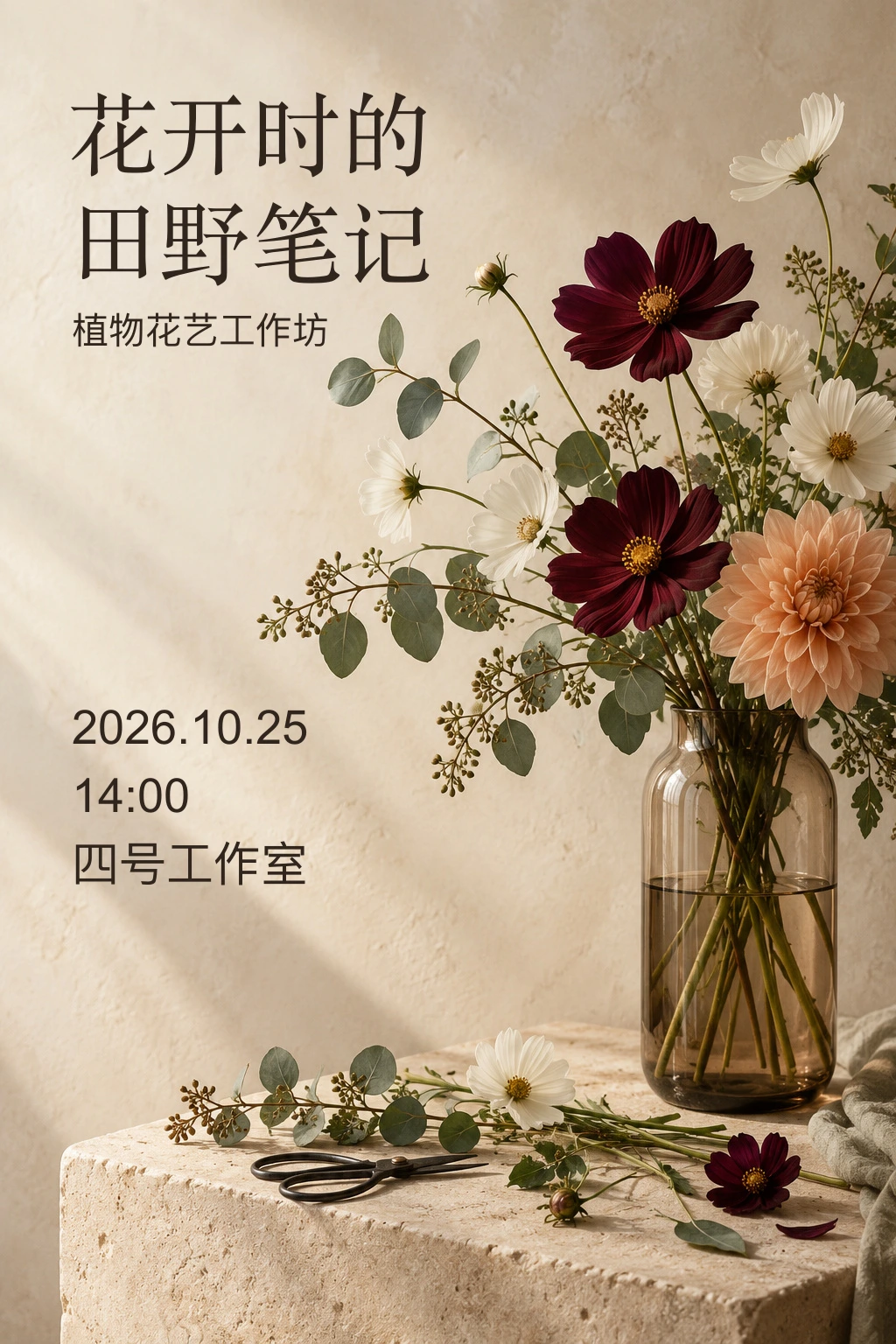
Translation can change width and height, including when the character count becomes smaller. W3C's internationalization guidance recommends flexible layouts and separating content from presentation. It does not provide a single expansion percentage that will make every language fit. W3C: text size in translation
Test the longest real strings early. Check that your chosen font has the required characters and punctuation. Preserve the information hierarchy across languages, but allow different type sizes, line breaks and spacing where reading requires them.
For the longer venue exercise, use “河畔植物艺术中心 · 四号工作室” as the Chinese teaching copy. Do not copy the English line break by character position. First read it as a place name and a room designation, then decide whether they belong on one or two lines. In both languages, the room must remain attached to the correct venue.
Also check what has stayed the same: the workshop has the same purpose, the date and time refer to the same event, and neither version introduces an extra promise such as “materials included.” Fluent wording is not permission to add facts. Compare the copy sheets again after visual adjustments, when accidental deletions are easiest to miss.
Check the background under the whole word
A color picker on one empty patch does not tell you whether a title is readable across the image. Follow each line over the lightest and darkest areas it crosses. Thin stems can interrupt letter strokes even when the general palette feels calm.

First try moving the text. If that cannot work, consider a deliberate solid panel or another image. Avoid reflexively darkening the entire photograph: it may harm the image while leaving some letters difficult to read.
For web text, WCAG 2.2's Level AA minimum is 4.5:1 for ordinary text and 3:1 for qualifying large text, with defined exceptions. These are web accessibility criteria, not a universal aesthetic rule for every printed poster. A nominal contrast pass also does not guarantee that a thin face over detailed foliage will read comfortably. W3C: contrast minimum
Do the contrast check after the final crop. A line that was over pale wall can move over a leaf when a responsive container crops its background differently. If using a backing panel, check its final opacity and the image underneath; checking the panel color in isolation is insufficient when it is translucent. Treat visual inspection and a contrast calculation as complementary checks, not substitutes for one another.
Build the web version as a second composition
The working web example pairs the same scene with ordinary English and Chinese text. Its image and information have separate areas, and the columns stack on a narrow screen. It is intentionally a web presentation rather than a stretched copy of the poster. All event information remains fictional.
In your own page, start by placing the title, description, date, time and full venue in the document as text. Then choose where the image supports them. Do not make a cropped background the only place an address exists. This structure can remain simple:
<article>
  <img src="botanical-scene.webp" alt="">
  <h2>Field notes in bloom</h2>
  <p>A botanical workshop</p>
  <p>25 October 2026 · 14:00</p>
  <p>Riverside Botanical Centre · Studio No. 4</p>
</article>
Here the image is decorative because this example's activity and practical details are fully expressed in the text. A flower-arranging lesson that relies on the visible shape would need a different alternative. The image-alternatives guide works through that contextual decision.
Finish at the delivery size
Export the poster, then open the exported file at the intended display width. Inspect the actual result at a phone-sized width, not only on a large editing canvas. Read the small practical details aloud. Check the longest translated line, accents, punctuation, edges and crop.
For a website, preserve the event title and practical details as ordinary HTML text alongside or instead of a flattened poster. That allows resizing, selection and other presentation changes that a bitmap cannot provide. W3C's images-of-text guidance explains the distinction and its exceptions. An editable SVG master is useful to a designer, but displaying that SVG as an image does not automatically turn its lettering into accessible page text. W3C: images of text
Keep the editable master, the approved copy and the final export together. A usable handoff lets the next person change the message without repainting the flowers—and makes it easy to check that every language still says the right thing.
Exercise: accept a changed venue without losing the design
Make an English and a Chinese version with the longer venue above. Keep the original date, time and image. Deliver an editable master, an image export and a web presentation with the complete details in text.
Check your result against these criteria:
- Copy: both versions preserve the same facts; neither loses “Studio No. 4” or invents an address.
- Hierarchy: you can find the title first and the practical information next without searching through the flowers.
- Fit: the longer venue does not collide with the photograph or cross the intended boundary. At the target display width, you can read it without opening the editing canvas.
- Editability: reopen the delivered master and change only the venue. The flowers and title stay intact.
- Web use: select and copy the date from the page. Narrow the window and check that the full venue remains visible and readable.
There is no single correct line break. A two-line venue can pass, as can a separate information panel or a web layout with text below the image. A beautiful export with missing venue information fails. A complete export whose practical text is illegible at its intended size also needs another revision.