AI Image Composition: From Visual Hierarchy to Verifiable Decisions
Use visual-attention research, a poster brief, and an imperfect illustrated example to separate image correctness, hierarchy, and final-layout checks.
On this page
Start composition with the image's purpose: define what must appear, what should stand out, and where the layout needs space. Then check content accuracy, visual hierarchy, and usability separately.
Why can a polished image still leave its subject unclear?
Imagine making a poster for an evening reading event at an independent bookstore.
You enter “an open book, a warm desk lamp, nighttime, cinematic, fine detail” and get an attractive image. The lampshade glows, the window reveals layers of city lights, and the wooden desk has convincing texture.
But the message you want to convey is “Come here and read a book tonight.”
If the image looks more like an advertisement for a lamp, or the headline has to sit across a busy window frame, more detail will not solve the problem. The composition has not organized the image around its purpose.
This article treats composition as work you can plan, inspect, and revise. It concerns where objects go, but also which information deserves emphasis and which should simply support the subject.
Define the image's job, turn the brief into observable relationships, and check the result against those requirements.
This article turns visual research into practical creative checks. The diagrams are original editorial drawings. The scene was made with OpenAI's image-generation tool, and details that failed the brief remain visible. No generation was run in LocalBanana, and we report no model success rates. The comparison exercise at the end has not been performed.
1. Separate content accuracy, visual hierarchy, and usability
Do not rush to give an AI image a single overall score.
For work with a specific purpose, we suggest answering three questions separately.
| Check | Question | Example from the reading-event poster |
|---|---|---|
| Content accuracy | Do the objects, quantities, attributes, and relationships match the brief? | There is exactly one open book; the lamp is to its left; the book has not become two overlapping notebooks. |
| Visual hierarchy | Does the emphasis match the creative intention? | The pages and reading space are recognizable; the lights outside do not turn the subject into a cityscape. |
| Usability | Can the image do its job in the final layout? | The headline and date fit legibly; the required crop preserves the book's essential outline. |
This is a project checklist, not a universal system for scoring aesthetics.
Research on alignment between text and images also gives us a reason to evaluate accuracy separately. TIFA breaks a prompt into answerable questions and checks whether an image matches its description. It evaluates faithfulness, rather than whether a poster communicates its intended message. TIFA paper
An attractive overall impression should not excuse a critical error. In this project, a missing required book, a headline that does not fit, or an incorrect event date cannot be offset by better lighting.
Nor does visual hierarchy mean that every image must have only one point of interest. We use a clear order of emphasis because this poster exercise needs to communicate an event theme. Multiple narrative centers, deliberate disorder, and visual puzzles can also be valid creative goals.
2. Three useful ideas from visual research, with their limits
Visual saliency describes what stands out, but cannot fully explain where people look
The classic model by Itti, Koch, and Niebur combines visual features at multiple scales into a saliency map, identifying image locations for prioritized processing. It offers a computational account of how differences within an image can guide attention. Itti, Koch, and Niebur, 1998
But people respond to more than brightness and edges.
Henderson and Hayes found that semantic information in scene regions also helps explain where people look. Later work questioned whether “meaning maps” independently measure the contribution of meaning; the original authors responded by clarifying what the maps measure. The mechanism and measurement remain debated. The useful, narrower conclusion here is that viewing behavior cannot be reduced to a rule that people look at the brightest area. Original study, subsequent critique, authors' response
For our example, this suggests a creative judgment to test:
If the book is the subject, inspect both how easily it can be recognized and whether unrelated areas create strong visual competition.
Suppose a prominent neon sign appears outside the window. The next step need not be to make the whole book brighter. You could first reduce the sign's brightness, color intensity, or detail.
One approach strengthens the subject; the other reduces competition. Choose by inspecting the particular image, rather than increasing contrast everywhere.
This discussion concerns human attention when viewing images. It is distinct from the computational mechanism called attention inside generative models, and does not establish how a particular model will interpret a prompt.
A subject needs to be distinguishable from its surroundings
The review by Wagemans and colleagues distinguishes perceptual grouping from figure–ground organization. We do not only identify local elements: we also organize which parts belong to an object, which side of a boundary owns a contour, and how surfaces relate to one another. Wagemans and colleagues, 2012
We use that distinction to propose a concrete composition check:
Do surrounding colors, lines, or overlaps make an important outline ambiguous?
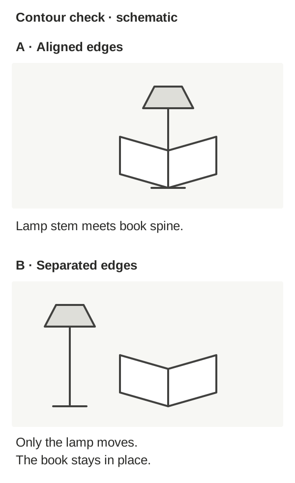
In the reading poster, check whether the page edges merge into the desk, the lamp stem lines up with the book's spine, or a window frame touches the book's edge and makes unrelated objects look like one structure.
If a revision is needed, describe the relationship causing the problem:
Keep a distinguishable light–dark boundary between the page edges and the desk. Offset the lamp stem from the book's spine. Do not let the window frame touch the book's outer contour.
These instructions are easier to check than “make the subject stand out.” They remain creative directions, not a technical guarantee that every edge will be preserved accurately.
You do not need to make every contour hard and sharp, either. The aim is to make the book recognizable, not to eliminate all overlap, soft edges, or atmosphere.
Including every noun does not mean getting the relationships right
T2I-CompBench separates compositional generation into categories including attribute binding, object relationships, and complex compositions. Here, compositional concerns whether concepts and textual requirements are combined correctly. It is not the same as composition quality in art.
“A blue-covered book beside a yellow desk lamp” requires more than a book and a lamp: the colors must belong to the right objects, and the spatial relationship must match the description. T2I-CompBench, original 2023 version
For a creator, the useful application is to turn an object list into a description of relationships.
“Book, desk lamp, night scene, warm” names the ingredients. “The lamp is to the book's left, its light falls on the open pages, and the night scene is confined to a small window in the upper right” explains how those ingredients form a picture.
Do not apply the performance of a model in an early study to every newer model. We are borrowing a way to break down the problem, not treating an old benchmark as today's capability limit.
3. Turn “sophisticated, soothing, cinematic” into observable requirements
Keep mood words if they help, but do not make them carry the whole composition brief.
For this exercise, we interpret “a quiet evening of reading” as follows:
The pages form the main recognizable light area. The lamp explains the light source. The window supplies a limited cue that it is nighttime. The image must also accommodate the event information.
This is our chosen visual approach, not the only correct expression of evening reading.
Write a minimal brief before generating.
| Decision | Requirement for this example | How to check |
|---|---|---|
| Intended use | A portrait 4:5 event-poster background | Check the actual output dimensions and the final crop. |
| Main message | A nighttime space where someone could pause to read | Ask someone who has not seen the prompt to describe what the image is about. |
| Required objects | One open book and one desk lamp | Inspect quantities and forms; check for extra books or lamps. |
| Spatial relationships | The book is below center and to the right; the lamp is to its left; the window is in the upper right | Use the image's left and right, avoiding an ambiguous viewing perspective. |
| Visual hierarchy | The pages are recognizable; the lamp and window support them | Compare the full image with a preview at its intended display size. |
| Text area | A continuous, fairly even dark area in the upper left | Place the actual headline, date, and location over it. |
| Style preferences | Warm interior light, restrained cool nighttime colors, natural materials | Compare atmosphere variations after the preceding requirements pass. |
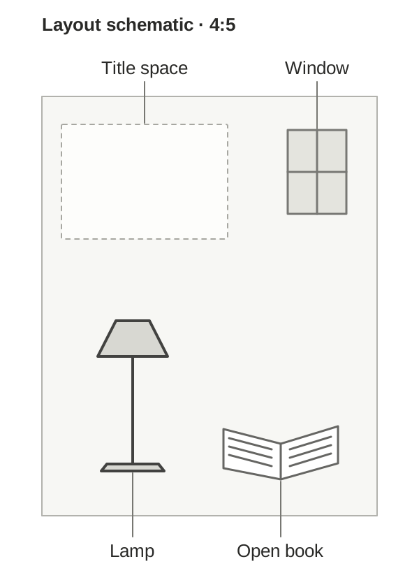
This table should come before the prompt.
Otherwise, it is easy to see the first result and mistake what the model happened to produce for what you wanted all along.
Separate requirements from negotiable preferences. In this project, the book must be complete and the headline must fit. Whether the desk is dark or light brown can be decided from the overall result.
Adobe's composition guidance treats principles such as the rule of thirds and leading lines as aids to judgment, rather than substitutes for it. It also asks photographers to anticipate practical uses, including cover layouts and text over the image. Adobe composition guide
We put the book toward the lower right to give the book, light source, window, and headline their own space—not because the subject must sit on a thirds line.
A book cover with a centered subject could reasonably need a different arrangement.
4. A complete prompt to practice with
Google's image-generation guidance recommends specific details, context about the image's purpose, and iterative refinement through small changes. Google image-generation guide
The template below applies those suggestions to our brief. It is an English translation of the Chinese practice template; neither version has been run verbatim. The scene shown later used a separate, downloadable English prompt. When trying the template, also select 4:5 in the tool's supported size or ratio settings and check the returned dimensions. Do not rely on the ratio written in the prompt alone.
View promptHide prompt
Create a portrait 4:5 poster background for an evening reading event at an independent bookstore. Do not include poster text.

The scene is an indoor wooden desk at night. Include exactly one open book and one small desk lamp, with no people or additional books.

Place the open book below center toward the right, keeping its complete outer contour inside the frame. Warm light falls on the cream-colored pages, with a clear but natural light-dark boundary between the pages and the desk. Preserve plausible paper and binding details, without readable text on the pages.

Place the desk lamp to the left of the book, mainly in the lower half of the image. Keep its shade out of the headline area in the upper left. Keep the lampshade's material recognizable, and avoid turning it into a large patch of overexposed white. Offset the lamp stem from the book's spine.

Include only a small window view in the upper right. Use a few dim, muted distant lights to suggest nighttime, with no prominent neon signs. Keep the window frame clear of the book's outline.

Reserve a continuous dark wall area with fairly even brightness in the upper left for a headline and event information to be typeset later. Keep this area free of objects, window frames, prominent texture, and strong patches of light.

The overall mood is quiet and warm, with a natural indoor photographic texture. Use the open book to convey reading; the lamp and window provide context without competing with the book for emphasis. Do not generate headlines, logos, or other readable text.
The point is not the prompt's length. Each paragraph has a job you can inspect: content, position, light, contours, or layout space.
Ask of each sentence, “What requirement does this place on the finished image?” If you cannot answer, consider removing it or replacing it with an observable visual condition.
Avoid conflicting instructions. For example, asking for an even headline area in the upper left conflicts with demanding dramatic light, rich texture, and city detail across the entire frame.
Style requirements must also serve the image's purpose.
If the lamp's exact design does not matter, you need not specify its material, period, brand, and every component. The aim is not to minimize information at all costs, but to spend description on what this project needs to control.
5. Change the input when words are not enough
Some problems are easier to describe; others are easier to draw.
“A quiet night” mainly describes meaning and style. Where the book belongs and how much space a headline needs can first be expressed as a two-dimensional layout.
For this example, place the actual headline, date, and location on a canvas with the final aspect ratio. Then add simple placeholders for the book, lamp, and window.
Once their positions work together, hide the text and use the layout as a creative reference. Download the text-free 4:5 layout PNG or the editable SVG. Check that your upload tool accepts the chosen format.
The placeholders describe position and approximate area, not materials. State that the reference supplies the layout, and that its placeholder colors, guides, and labels should not be copied. How closely an ordinary image reference follows that layout depends on the model and the result. Uploading a sketch does not lock coordinates.
ControlNet demonstrates a different approach: within particular diffusion-model architectures, spatial conditions such as edges, depth, or pose can guide generation. This shows that spatial structure can be expressed through a dedicated conditioning channel rather than through text alone. ControlNet paper
It does not mean that every image generator uses ControlNet, or that uploading an ordinary reference image is equivalent to supplying those spatial conditions.
Choose an input or editing method that directly expresses what you need to control.
Use language for purpose and mood; a layout sketch for position and proportion; explicit region controls for local changes when the tool supports them; and separate design layers for precise text, logos, and coordinates.
This is a way to divide the work, not a requirement to use every tool on every project.
A lampshade that is too bright need not trigger a complete rebuild of the workflow. But if a headline box must occupy an exact position, repeated generation need not be responsible for the final typesetting.
6. Inspect the same image in four views
The checks below form a suggested creative workflow. They are not an eye-tracking experiment or an automated aesthetic score.
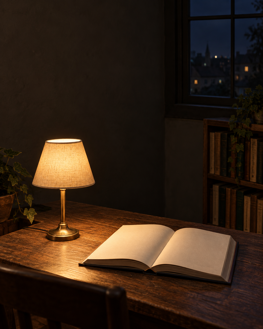
The book's outline is recognizable and the upper left offers layout space, but the image does not fully satisfy the brief: the shelf on the right contains additional books despite the explicit request for no other books. Plants have also appeared on both sides. They were not requested, but the actual prompt did not prohibit plants throughout the scene; whether to retain them is a project decision, not a failure of a predeclared no-plants requirement. The prompt requested 1280 × 1600; the returned dimensions differ. The lampshade retains visible material, but remains a prominent warm light area. Without eye tracking, we cannot state where a viewer will necessarily look first.
You can view or save the complete English prompt actually submitted. The tool did not supply a verifiable model version for this call, so we do not attribute the image to a specific model version. This single output illustrates the inspection process; it cannot establish whether a prompting approach generally succeeds or fails.
Original size: is the content correct?
Start with the content.
Is there still exactly one book? Does its open structure make sense? Do the lamp stem, book spine, or window frame connect incorrectly? Are important parts cut off?
This image fails the “no additional books” requirement. Even if the bookstore atmosphere looks plausible, do not quietly relax the original requirement after generation. Record the failure, then decide whether to edit the image or have the project owner explicitly revise the brief.
Display size: is the subject still recognizable?
View the image close to its intended display size. Inspect a small event-listing image, a poster on a phone, and the original on a desktop separately.
There is no single thumbnail size that suits every platform.
For this exercise, ask whether the open book remains recognizable when reduced, or whether the image reads mainly as a bright lamp against a dark background.
The answer is not always to make the subject bigger. If enlarging the book would consume the headline space, first consider reducing irrelevant nearby texture or improving separation at its edges.
Grayscale copy: do the light and dark areas work together?
Temporarily remove color to inspect the arrangement of light and dark. In this example, compare the pages, lampshade, window, and desk, looking for an overly strong light area in a supporting element.
But a grayscale copy removes differences in color.
If an image's hierarchy depends mainly on color, becoming ambiguous in grayscale does not prove that the original fails. After diagnosing the light–dark structure, return to the color image and check again.
Do not present grayscale images, blurred images, or manually marked “hotspots” as measured eye-tracking heatmaps.
Complete layout: is it ready to deliver?
Place the actual event headline, date, and location. Check whether background texture interferes with letter edges, brightness changes cross the text, or cropping removes important information.
There is also a change in hierarchy to consider:
The background image may center its message on the book, while the final poster gives first priority to the event headline.
Reassess the whole poster after adding text, rather than insisting that the background image's original hierarchy remain unchanged.
For practice, try “Read a Book Tonight,” followed by the fictional event information “Friday, 7:30 p.m. · Reading area.” These are layout-testing words, not an announcement of a real event. Our example has not received its final typesetting and already fails the object-count requirement, so we do not label it a deliverable design.
7. Let the error determine the next change
Do not translate every dissatisfaction into “make it more sophisticated.”
Locate the problem, then decide whether to change the input, edit the image, or revise the layout.
| What you observe | Address first | Recheck afterward |
|---|---|---|
| An extra book, or an incorrect book structure | Object count and local structure | The placement and headline area still survive. |
| The lampshade is more prominent than the reading content | Lampshade highlights and material, rather than overall brightness | The pages have not been darkened too, and the light source still makes sense. |
| The view outside turns the subject into a cityscape | The window's area, brightness, or density of detail | Enough context remains to suggest nighttime. |
| The pages are hard to distinguish from the desk | The boundary, local light–dark relationship, or overlap | The change has not introduced an unnatural outline or halo. |
| The headline area looks empty but is hard to typeset over | Texture and brightness variation beneath the actual text | Text remains legible at the final size and crop. |
| Fixing one problem repeatedly changes other areas | Return to a retained version; consider local controls or compositing layers | Previously accepted content and layout remain intact. |
For example, if only the lampshade's highlights need attention, narrow the edit request:
View promptHide prompt
Adjust only the lampshade's highlights. Reduce the overexposed white areas and restore recognizable lampshade material, so the shade no longer forms a large bright patch that dominates the image.

Preserve the book's position and size, the light on its pages, the window's position, and the headline area in the upper left. Do not change the overall color palette or add objects.
This edit has not been performed. It is not a promise that areas named for preservation will remain unchanged. For the displayed image, address the additional books that fail the brief before deciding whether to revise the lampshade.
After each edit, record both whether the target problem improved and whether something previously correct regressed.
An improvement in one area can still leave the complete image less usable.
It also helps to recognize when generation is not the right next step. If a trademark, fixed lettering, or product structure must remain exact, preserving approved material and compositing it may serve the project better than asking a model to redraw it.
The goal is to meet the delivery requirements; one generation need not perform every step.
8. Run a comparison that helps you learn
A single output can show what happened this time. It is insufficient to establish that a phrasing usually works better.
The GenEval 2 preprint notes that agreement between automatic evaluation and human judgments can drift as models change. Do not draw a general rule from one selected image, or treat an automatic score as a permanently reliable judge. GenEval 2 preprint
The following teaching exercise has not been performed. It proposes an initial check of one revision, and the earlier scene image is not part of this A/B exercise.
Question: for the same scene brief, does adding an explicit lampshade-highlight constraint make it easier to obtain a composition that suits the reading theme?
Keep the practice template in Section 4 as version B. For version A, remove only this sentence:
Keep the lampshade's material recognizable, and avoid turning it into a large patch of overexposed white.
Keep all other text, reference images and their order, model, dimensions, and visible settings the same.
This compares the addition of one constraint. It does not compare the general merits of long and short prompts.
You could start with four outputs per version, retaining every output. That is a teaching-budget example, not a basis for claiming statistical significance or general effectiveness.
If the tool exposes random seeds, record them and use paired seeds within the same model version and settings. If it does not, record “unavailable” rather than inventing a value.
Holding other inputs constant does not mean that the other pixels will remain unchanged. The generated book, lamp, and window may all vary; those changes also need inspection.
Write the checks before looking at the results:
Are object quantities and relationships correct? Does the lampshade contain a large area of highlights with no recognizable material? Is the book recognizable at the intended display size? Can the actual headline be placed legibly?
For each image, record pass, fail, or uncertain, with the reason for the judgment. Do not retain only the best image.
If someone else helps review, hide the version labels and shuffle the image order. Ask “What is this image mainly about?” or “Which areas draw your attention?” rather than “Did you look at the book first?”
These answers are subjective reports. They are not measurements of first fixation, and cannot directly establish click-through or conversion rates.
Use the composition checklist and comparison worksheet to record inputs, observations, and limits for every image, then write a conclusion for this project. Keep “uncertain” available; do not automatically count it as a pass.
Only after completing those records should a revision be described as an effect observed in this exercise.
Recheck when the model, subject, or intended use changes. An earlier observation is not a fixed rule.
Apply the checks to your own project
The prompt expresses requirements. Composition organizes information. Review determines whether the result does its job.
When a polished AI image still disappoints, pause before adding more flattering adjectives.
Are the objects and relationships wrong? Does the emphasis miss your intention? Or does the image fail when placed in the real layout?
These problems call for different changes and different evidence.
The reusable skill is being able to explain what to preserve, what to change, and what observation would show that it improved.
To try the approach in LocalBanana, start from the image-creation page and prepare your brief. See the aspect-ratio guide and multiple-reference guide for choosing a canvas and preparing references. This article does not assume every model exposes region locks or the same settings; use the controls available in your current interface.