Using Multiple Reference Images: Subject, Composition, and Style
Assign each reference image a role, set priorities when the images conflict, and check the subject, composition, and style in the generated result.
On this page
Give each reference a specific job: one can define the subject, another the layout, and another the light. Then state what to keep, what to leave behind, and which instruction takes priority if the images disagree.
This walkthrough plans a product banner around one mug. The goal is to keep its identifying details, place it beside space for a headline, and borrow the atmosphere of a different photograph. The same planning method can help with a portrait, a room, or an illustration; the details you inspect will change with the task.
Define the finished image before choosing references
Our brief is a 16:9 banner with the mug on the left and the right half clear for a headline. The headline will be typeset later, so the generated image should contain no text.
The mug has four details to preserve: an ivory cylindrical body, a cobalt-blue D-shaped handle on its right, a thin blue rim, and one small blue dot on the front below the rim. Warm light and a pale-peach setting are welcome, but changing those blue details to peach would fail the brief.
This gives us a useful priority order: product identity first, usable layout second, atmosphere third. Decide that order before generating. A pleasing image can still be unsuitable if it changes the product or leaves nowhere for the headline.
For your own project, write down the intended use and the details that must survive. Choose references you have permission to use, with the relevant features clearly visible. Add an image only when it answers a question the existing inputs do not resolve.
Give each reference a job and a boundary
Subject, layout, and style are labels in our brief. They are not separate weight settings or locks, and a project does not need an image for every label. One reference can supply several things if you name them clearly.
Google's image-generation guide includes composing from multiple images and explicitly describing details to preserve. The division below turns that idea into a set of instructions we can check against the result.
Image 1: keep this product
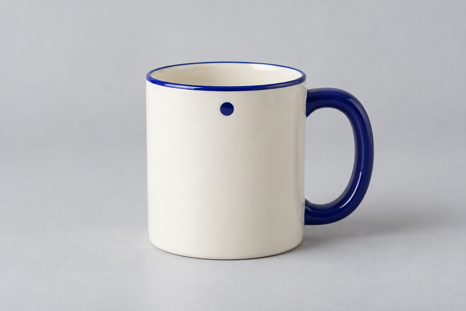
Take: the mug's proportions, material, handle, rim, and dot.
Do not take: the original background or centered placement. We are moving the product into a new composition, not asking to reproduce this entire photograph.
Name the features that distinguish the subject. “Keep the same mug” leaves the reader—and the subsequent review—with less to check than “keep the blue handle, thin rim, and single dot.” These are requests to the generator; you still need to inspect whether they survive.
Image 2: borrow this layout

Take: a complete mug on the left, resting on a surface, with clear space on the right.
Do not take: the placeholder's gray material, simplified shape, or diagram markings.
A rough diagram is useful here because we need a spatial arrangement, not a second product design. State what the empty space is for: a headline needs an area that remains readable after text is placed over it, not simply an area without the main subject.
Image 3: borrow the light and setting
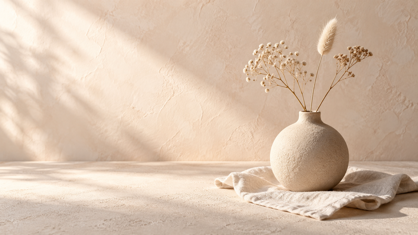
Take: the cream and pale-peach background, plaster texture, and soft light from the left.
Do not take: the vase, dried flowers, linen, or their placement. The mug's blue details also keep their own color.
“Use this style” leaves open whether you mean its colors, objects, camera angle, or lighting. Naming the few properties you need makes the instruction more specific. If an unwanted object appears in the result, you also know which part of the reference to address.
Combine the instructions and resolve conflicts
The core instruction is short:
Keep the mug from Image 1. Use Image 2 for its left-side placement and empty right half. Borrow only the warm setting and soft left-side light from Image 3. Preserve the product details before matching the mood.
The priority matters because our references disagree on purpose. The product photograph establishes blue accents, while the lighting reference supplies a warmer palette. The layout diagram determines placement even if the still life places its subject elsewhere.
Use image numbers that match the attachment order, and name the pictured subject as well. Recheck those references if you remove or reorder an attachment. Priority wording expresses the intended compromise; it does not guarantee a model will implement a fixed hierarchy.
To try this example, save the references in order: product image, layout sketch as PNG, and lighting image.
View promptHide prompt
Create a photorealistic 16:9 product banner using the three attached references.

Image 1 is the product reference. Keep one ivory cylindrical ceramic mug, its cobalt-blue D-shaped handle on the right, thin cobalt-blue rim, and single small blue dot on the front below the rim. Preserve the mug's proportions and these identifying features. Do not add a logo or change the blue details to match the background.

Image 2 is the layout reference only. Place the complete mug on the left, resting on a surface. Keep the right half clear for a headline that will be added later. Use the diagram for placement and empty space, not for its gray material or simplified shape. Do not render its guides or markings.

Image 3 is the lighting and background reference only. Borrow its warm cream and pale-peach plaster setting and soft light from the left. Do not include its vase, dried flowers, linen, or their placement.

When references conflict, preserve the product details from Image 1 first, the layout from Image 2 second, and the mood from Image 3 third. The final image should contain only the mug and the softly lit setting, with no text, extra objects, borders, or split panels.
Prepare a similar task in LocalBanana
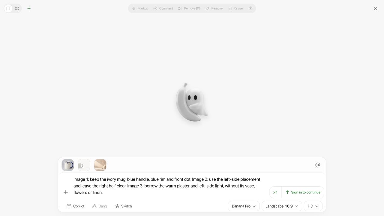
On the desktop interface, open Generate Image. For this preparation check, we selected Banana Pro and uploaded the product, layout, and lighting images in that order. The vector layout was first exported as a PNG.
- Open Add references, then choose Upload in the Images drawer.
- Upload the images and inspect the attachment previews. In our check, Ref 1 was the mug, Ref 2 the sketch, and Ref 3 the still life. Remove unrelated attachments and correct the prompt if the order differs.
- Close the drawer. Open the ratio control, expand Landscape ratios, and select 16:9.
- For the numbered-image instructions in this article, leave Precise references off. Its off state says “use all attachments.” When enabled, it uses only @mentioned attachments. This selects which images participate; it does not lock the product or assign subject, layout, and style weights.
- Enter the prompt, check the image order and ratio again, and sign in if the interface requires it before generation.
These details come from the complete interface screenshot, captured on September 19, 2026. We checked input preparation while signed out; generation required sign-in, and no task was submitted through LocalBanana. The short text in the full screenshot is a preparation note, not the complete prompt used below.
Inspect the result against the brief
We submitted the complete prompt above with Images 1, 2, and 3 in that order to OpenAI's image tool. The photograph-style references were also generated with that tool; the layout was drawn as a vector diagram. This is a single worked example made for the article, not a LocalBanana output or a model comparison. We kept the first returned result, without regenerating or retouching it.
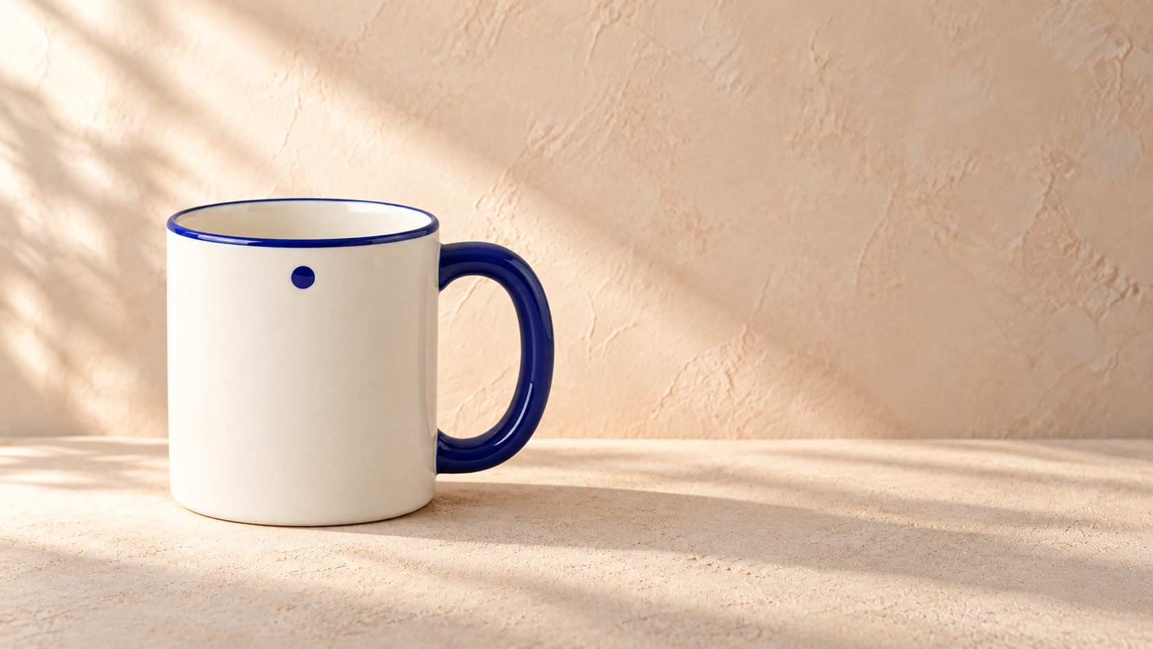
The visible identifying details are present: ivory body, blue right-side handle, blue rim, and one front dot. The whole mug sits on the left. The vase, flowers, linen, diagram markings, and text are absent. The cream and pale-peach setting and light from the left also appear in the result.
The remaining issue is the headline area. It is free of objects, but the wall has pronounced texture and a brightness gradient, with a shadow across the lower right. Empty of objects does not automatically mean ready for readable text. We have not tested an actual headline on this image, so that part of the brief remains open.
Review the image in the same order as the brief:
- Product: compare the shape, handle, rim, and dot with Image 1. Inspect small details at full size.
- Layout: check that the whole mug fits on the left. Place the actual headline over a copy of the image to see whether the right half is usable.
- Atmosphere: inspect the background and light. Look for objects carried over from Image 3 that the brief excluded.
Keep these judgments separate. “The light looks right” does not answer whether the mug still matches. For a real commercial product, compare against approved product images before using the result; if an exact mark or shape is essential and keeps changing, use the original product image in a compositing workflow.
Decide what to change next
For this example, a useful next step would be to test the actual headline. If the background competes with it, ask to soften the texture and even out the light in that area while preserving the mug. That edit has not been run here.
If the product changes in your own result, return to the subject instruction before adding more mood words. If the product is correct but the right side is crowded, address placement and empty space. If unwanted props appear, identify those objects explicitly rather than asking for an undefined “cleaner” result.
| What you observe | A focused next instruction |
|---|---|
| The blue handle or dot changes color | Preserve the cobalt-blue handle, rim, and single dot from Image 1; apply the warm palette only to the setting. |
| The mug moves into the headline area | Keep the entire mug in the left half; leave the right half free of objects and strong visual detail. |
| The vase or linen appears | Remove the vase and linen; use Image 3 only for the background and direction of light. |
These are suggested revisions, not tested fixes. Change one requirement at a time so the next result is easier to assess, while remembering that another generation can vary even without a prompt change. Keep the previous version and check the preserved details again after each revision.
To try the method, start with one subject image and write down what must stay unchanged. Add a layout or lighting reference only for the decisions you still need to make. The aspect-ratio guide explains how to set the canvas; the reference instructions then describe what belongs inside it.