
Chinese Poster Test: Can New Image Models Keep Every Line?
Compare exact Chinese copy, missing details, layout and phone readability using one fictional bookstore poster brief.
On this page
A Chinese poster can look finished while still changing an event's meaning. Judge its exact copy, information completeness and readable layout separately before deciding whether the native output can be used.
In this October 23, 2026 comparison, all seven returned images preserved the five requested items of Chinese copy on visual inspection. The more useful differences were where the information landed, how much attention the illustration took, and what still needed checking at a small display size. This task did not establish a clear winner in Chinese character accuracy.
Eight requests were planned. One Grok request failed before returning an image; it has no text-rendering score. Every returned image is shown below, including both outputs for the other three conditions. This is a small, single-prompt comparison, not a general model ranking.
Start with a message that must survive the design
The brief is a fictional evening book exchange at 夜航书店. It calls for a portrait 3:4 editorial poster with paper texture, blue ink and generous quiet space. The image must communicate these five strings, with no other readable wording:
| Required copy | Why it matters |
|---|---|
| 夜航书店 | Identifies the fictional venue |
| 秋夜交换书 | Names the activity |
| 10月30日 19:30–21:00 | States the date and full time range |
| 带一本读过的书来 | Tells the reader what to bring |
| 无需购买 | Removes an expected purchase requirement |
There is no real event being advertised. The point is to test a modest but consequential message: a title alone is not enough. A missing final instruction changes what a reader understands, even if the remaining lettering is beautiful.
Keep a separate copy sheet. Read against that sheet instead of trusting the overall impression. The day, two time values and connecting dash deserve a deliberate check; so does the small instruction at the bottom. A correct-looking paragraph is not an exact transcription.
What the official model descriptions establish
The four conditions are two GPT Image 2.5 variants, Nano Banana 2.1 and Grok Imagine Image 2.0, not four independent model families.
OpenAI distinguishes Flare's everyday image-generation role from Sunburst's emphasis on precise creative work and editing. The introduction explains why we test both; the Flare and Sunburst model pages document selectable quality levels. None predicts the accuracy of this particular Chinese poster.
Google describes improved text rendering and infographic layout in Nano Banana 2.1. That is a vendor statement motivating the test. The Grok Imagine Image 2.0 model page identifies its image input/output capabilities, without establishing a Chinese-copy success rate. Our observations below come from the returned images.
What was submitted and what came back
The same text-only prompt went to four requested model conditions, with two planned requests each. One first-round Grok request was rejected on a parameter before an image came back. It was not rerun; its second planned request produced the one Grok image shown here. Do not interpret that missing image as evidence about Chinese spelling ability.
| Requested condition | Requests / returned images | Actual image dimensions |
|---|---|---|
| GPT Image 2.5 Flare | 2 / 2 | 768 × 1024 each |
| GPT Image 2.5 Sunburst | 2 / 2 | 768 × 1024 each |
| Nano Banana 2.1 | 2 / 2 | 896 × 1200 each |
| Grok Imagine Image 2.0 | 2 / 1 | 864 × 1152 |
All requests specified 1K and 3:4. The GPT requests and second Grok request used medium quality. A medium value was also sent for Banana, but it was not established as a comparable public image-quality setting; identical labels do not imply equal image quality or computation.
The requested composition was 3:4. Nano Banana's returned dimensions are close to that ratio, not mathematically identical. The images below retain their actual proportions. Public WebP copies preserve the original dimensions and decoded pixels; no text was repaired, retouched or regenerated for display. The evidence summary records the retained set and image hashes.
Model labels describe the requested conditions. The returned image payloads did not independently authenticate the underlying model version, and this was not a test of the providers' official website interfaces. Matching the prompt also does not make different implementations or similarly named quality settings equivalent. Our copy checks concern visible glyphs and spacing in raster images; they cannot certify Unicode code points or the presence of an editable text layer.
The prompt requires exactly five lines; slashes separate instructions and must not appear in the artwork. It asks for a small book illustration, clear hierarchy and flat artwork rather than a photographed poster.
View promptHide prompt
Create a finished portrait 3:4 Chinese bookstore event poster. Elegant contemporary editorial design, warm ivory paper, deep ink-blue typography, generous negative space, a small restrained illustration of an open book in lamplight. Use clear visual hierarchy: bookstore name small, event title prominent, date and time easy to find, the invitation and free-entry note legible at phone size. Typeset exactly these five lines, with every character and number preserved: 夜航书店 / 秋夜交换书 / 10月30日 19:30–21:00 / 带一本读过的书来 / 无需购买. The slash characters in this instruction separate lines; do not print the slashes. Do not add any other readable text, numbers, logos, QR codes or signatures. Keep every line inside generous safe margins. Render the flat poster artwork directly, not a photograph of a poster or a perspective mockup.
All seven native results
Flare: the same information, two reading paths
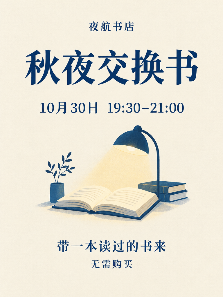
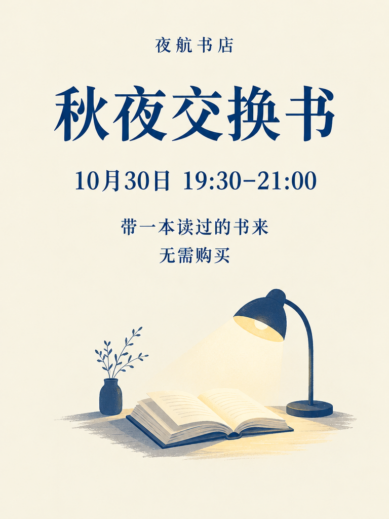
The second output places all five lines in one uninterrupted text area. The first asks the eye to continue below the picture to finish the message. Neither changes the content; the difference matters when deciding how quickly someone can find the practical instructions.
Sunburst: richer scene detail changes the background behind type
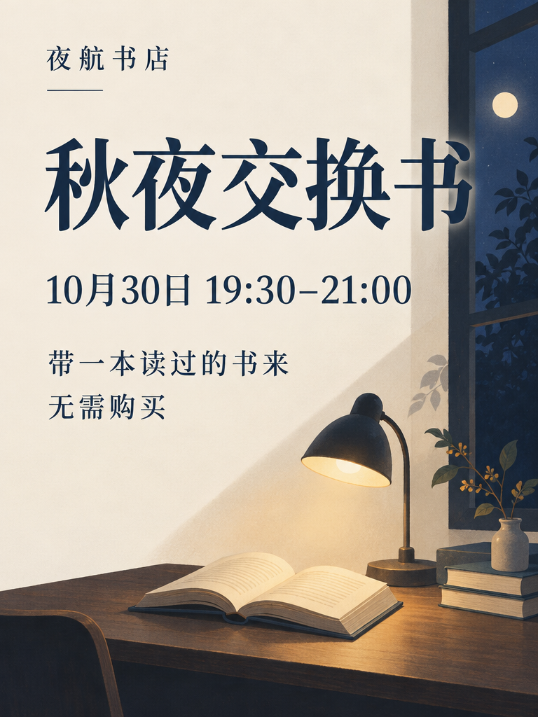
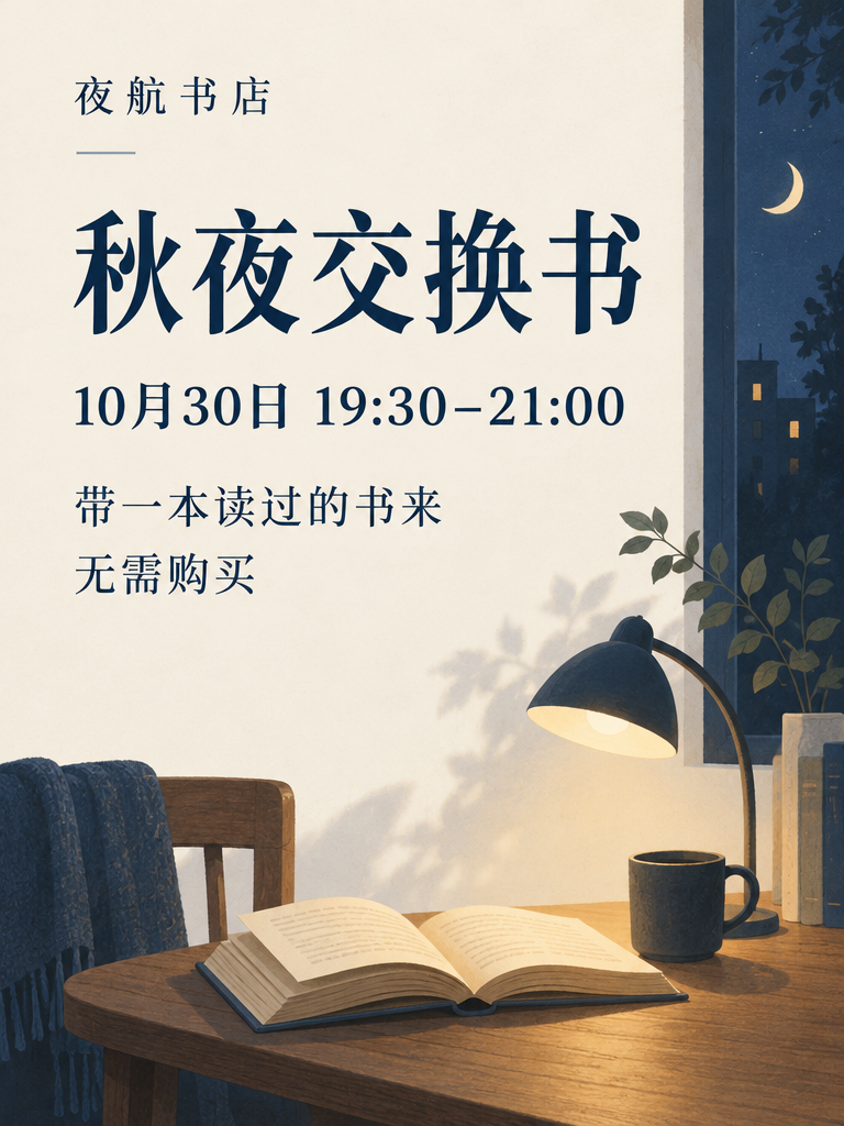
Both are atmospheric flat artworks, not photographs of printed sheets. Their room scenes are more elaborate than the brief's small, restrained illustration. That is a direction choice to review separately from spelling. The first also deserves a local contrast check where the final title character crosses the window; the second avoids that crossing.
Nano Banana: generous space also separates related details
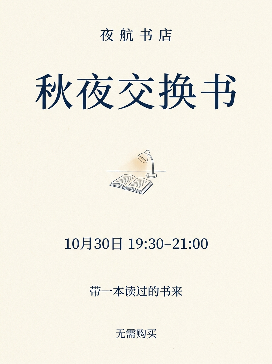
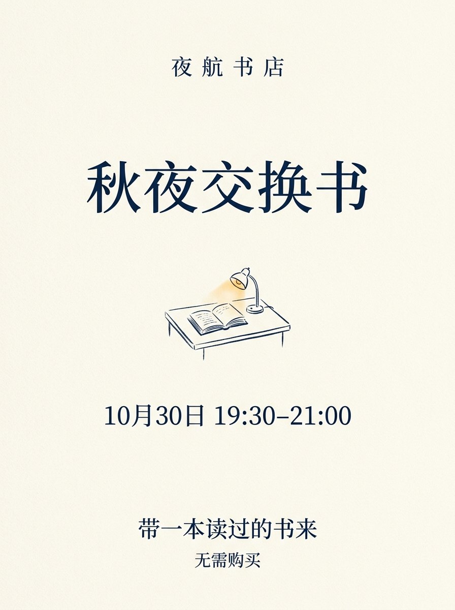
These outputs follow the restrained illustration direction closely. The useful follow-up is whether the lower instructions remain discoverable and readable in the intended placement. Empty space is not automatically a fault, but neither is it proof that the message will be read as one unit.
Grok: one returned poster, not a pair
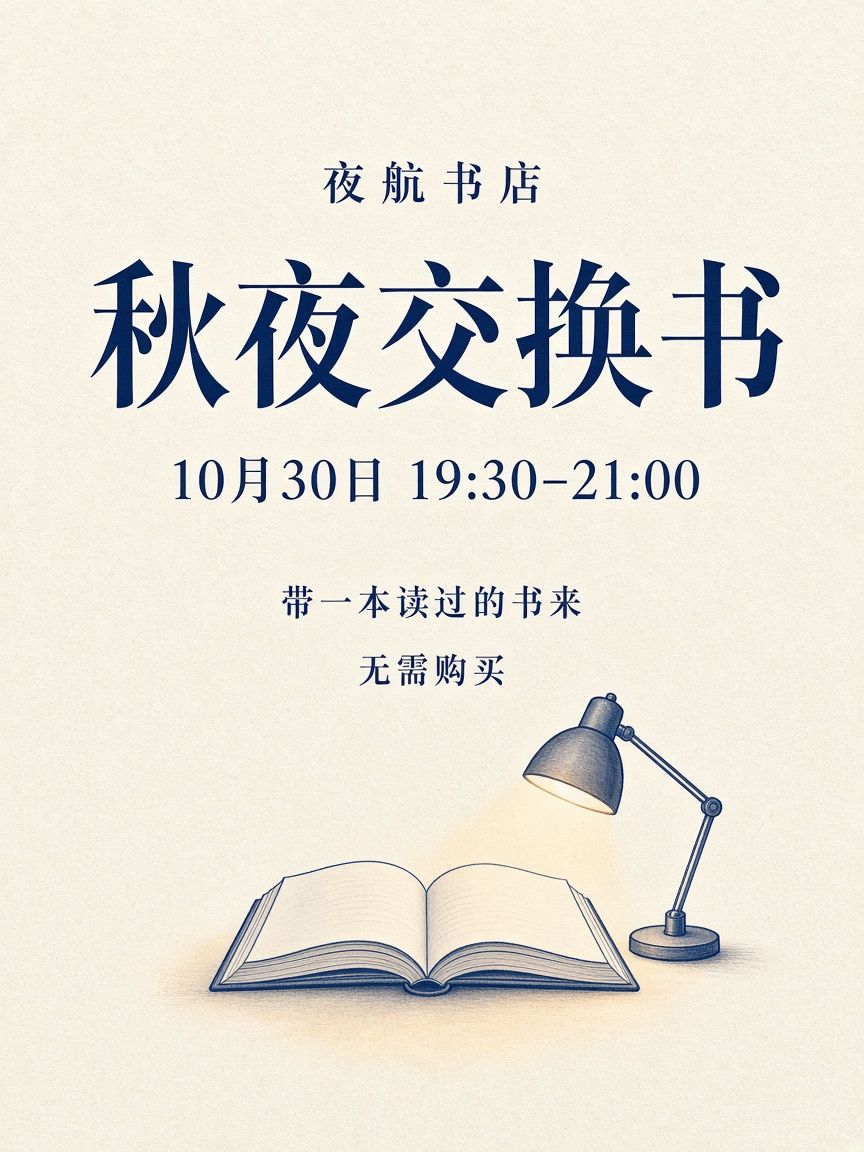
The returned image keeps the message together and reserves the lower area for the book and lamp. With only one image, there is no within-condition pair to compare. Its presence here supports an observation about this output, not a conclusion about how consistently Grok would repeat it.
Read the characters before judging the composition
Inspect the native file before any relettering. Transcribe what is visible, not what you expect the poster to say. Compare each requested string and explicitly record missing, changed, added or uncertain characters. Record line grouping separately: the five-line instruction can fail even when every character survives.
For the date line, read the two ends of the time range separately. Then inspect the punctuation and the date. If the display is too small to distinguish a glyph, enlarge the original file; do not ask an image model to invent a sharper version of the evidence. If the original remains ambiguous, record uncertainty rather than granting an exact pass.

Here the visible line retains October 30 and both time endpoints. Inspecting it separately prevents the large title from drawing attention away from a wrong numeral. The complete poster still determines whether that correct line is easy to find.
Meaning and exactness are related but separate. A typographic punctuation substitution may leave the intended time understandable; it still differs from a brief that requested an exact string. Conversely, one incorrect numeral may look visually minor while directing a reader to the wrong time. Preserve both observations instead of treating all errors as equally harmless or equally catastrophic. In particular, “无需购买” means no purchase is required; changing it to a claim about free admission would not preserve the approved copy or exactly the same promise.
Read outside the five expected text regions too. Extra lettering can appear on book spines, stamps or decorative marks. When the brief forbids any additional readable copy, a plausible bookstore name or invented caption is a departure even if it suits the mood.
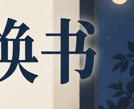
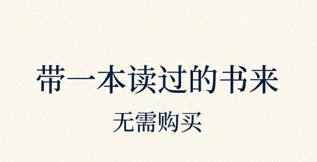
These crops isolate two different concerns. Sunburst's title needs a background check, not a correction to the transcribed word. Banana's smaller instructions need a whole-poster check, not a verdict based only on an enlarged detail. Cropping changes what attracts attention, even when it changes no source pixels.
Completeness is not the same as readable hierarchy
After the transcription, inspect the whole poster at its intended presentation size. Can a reader find the event, then the date and time, then the instruction and purchase condition? The specific ordering is an editorial reading task, not a universal typographic law.
A poster can contain all five strings and still make the last two effectively invisible. Treat that as a layout issue rather than rewriting the transcript as though the words were absent. Conversely, a large, clear title does not compensate for an omitted time.
Check the composition without requiring all models to make the same design. A serif face, a bold sans serif and a hand-drawn treatment can all be acceptable if the needed information survives. The brief asks for an editorial direction and readable content, not a pixel-identical arrangement. Distinguish a preference for one aesthetic from a broken requirement.
For a phone check, record the actual displayed image width. Source resolution alone does not tell you the size of the words on screen. A detail crop helps inspect the glyphs, but it cannot prove that a reader can discover that line in the full poster. Keep the complete images alongside the relevant crops.
In this page’s 320-pixel phone viewport, each complete poster is displayed at about 288 pixels wide. At that size, the dark background behind the final title character in Sunburst request 1 and the small notes in both Banana outputs need a closer, enlarged check. That is neither a spelling failure nor evidence that the native layout needs no adjustment. This is an editorial inspection, not a reader study.
Decide what to keep and what needs another stage
Use three practical outcomes rather than a single overall score. A native output can meet the stated copy and presentation requirements; it can provide a promising image direction that needs controlled relettering; or it can need a broader composition revision before it is useful. These are judgments about this particular deliverable, not permanent labels attached to a model.
When repairing copy, preserve the original as evidence and work on a duplicate. Move the approved words into editable text objects, choose line breaks deliberately and check the whole message again after export. If the generated background makes this awkward, rebuilding the layout around the artwork may be cleaner than repeatedly patching individual glyphs. The editable typography guide demonstrates this separate production step.
A successful manual repair would demonstrate a useful assisted workflow. It would not retroactively make the model's original text correct. A good comparison labels those two outcomes separately.
For a web event page, also provide the details as ordinary text. Readers should not have to infer a date from an attractive image, and an image alternative should not become the only accessible store of essential event information. See the image-alternatives guide for deciding what the poster image itself needs to describe.
A short inspection exercise
Choose two outputs whose wording matches, but whose information is arranged differently. Read the five-line copy sheet, close it, then find the time and purchase condition in each complete image at the same display width. Describe one concrete difference: a line below the illustration, a dark shape behind a character, or a larger gap between related details.
A useful answer identifies that location and explains what you would check next. “This model is better at Chinese” is not supported by two differently arranged but correctly worded posters. Nor does the failed request create a misspelling to count against Grok.
If your chosen layout needs repair, describe the repair as a separate production step. Keep the native result beside it, preserve all five facts, and rerun the complete copy and display-size check before delivery.