White Balance in AI Images: Color Cast, Warm Light, or Cream Paper?
Separate material color, overall color cast, and mixed lighting before correcting an AI image. Keep a neutral reference without erasing the mood.
On this page
Before cooling down a yellow-looking image, decide what is yellow: the material, the light, or the whole picture. White balance can establish a useful neutral reference. It should not automatically turn cream paper white or erase the atmosphere of a warm room.
For an AI-created interior or product scene, the practical goal is a coherent color relationship: the product stays recognizable, the lighting has an understandable character, and any correction serves the image's purpose. A shop listing and a quiet evening editorial may need different choices.
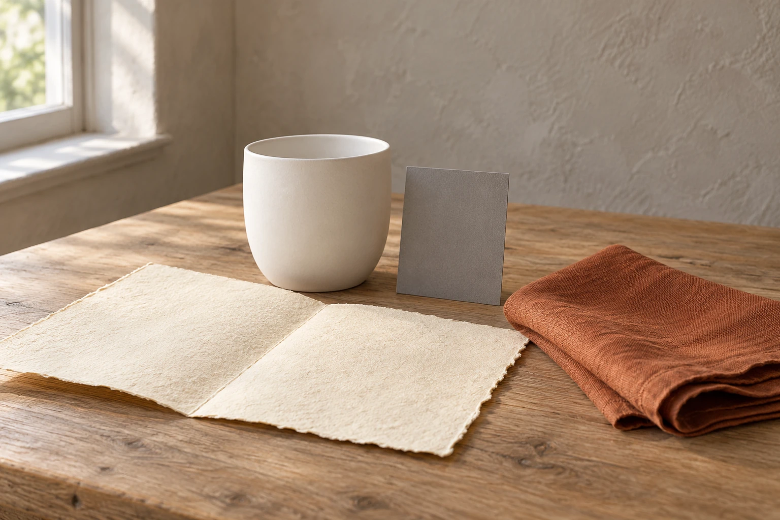
The two complete still lifes are separately generated AI teaching illustrations. The numbered reference map and local detail panels derive from those images. They demonstrate where to look, not a calibrated photograph or a measured correction sequence. The gray card is an illustrated object, not proof of accurate color reproduction.
Set a color goal before touching a slider
For this lesson, imagine the image is an editorial about a quiet morning at home. You want white ceramic to remain recognizable, cream paper to stay warmer than the ceramic, and rust linen to keep its material identity. You do not need every pale pixel to be neutral.
Write those three requirements beside the unchanged input. For an accurate product listing, replace this editorial goal with a real product reference and an agreed color workflow. The image's purpose determines what “correct” means. A neutralized evening lamp may meet one brief while destroying another.
Use the same viewing environment for each candidate. Compare against the original, not your memory of a picture you saw before making several edits. A later version is only useful if you can say which requirement improved and which ones survived.
Separate object color from the color of its light
A white ceramic cup and a cream sheet of paper should not necessarily match. Cream is a material choice. Warm illumination may shift both toward yellow; a different image treatment may shift the entire scene again. If you do not separate these causes, a correction that improves the cup can destroy the paper.
White balance adjusts the image's color response to illumination. It can help an intended neutral object read as neutral, while leaving genuine object colors distinct. In photography, this is an interpretation of captured light, not a command to make every pale surface identical. Adobe: white balance in photography
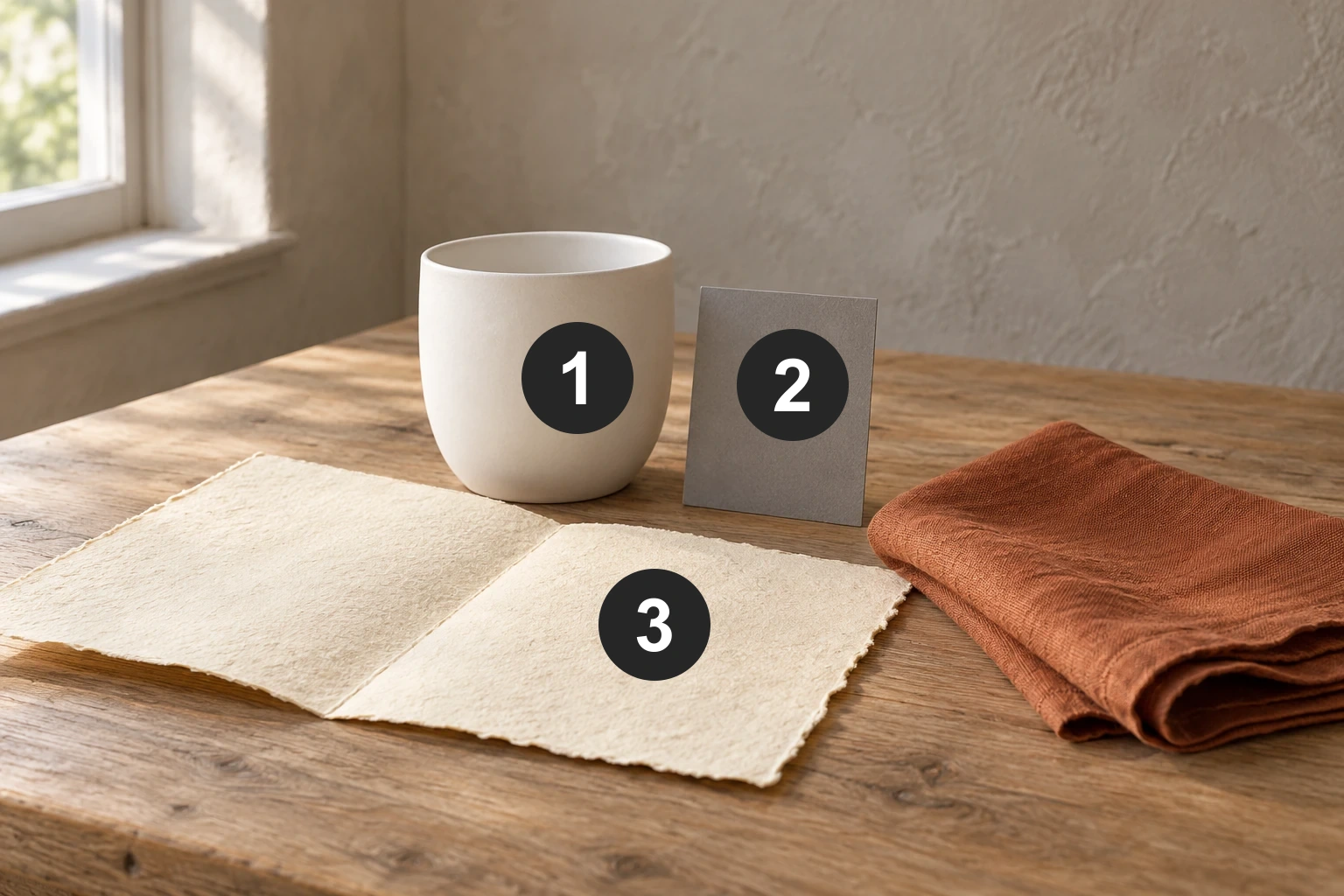
Read the first illustration in three passes. First identify materials: white ceramic, cream paper, rust linen, gray card. Next look across the pale surfaces for a shared tint. Finally look for local differences associated with their position or facing direction. This does not reveal the original spectrum of the light, but it prevents treating every warm pixel as the same problem.
If the cup reads acceptably while the cream paper remains warmer, there may be nothing to fix. If the cup, card and pale background all share an unwanted tint, a global adjustment is a reasonable first trial. If only one side of the cup looks different, investigate local illumination or reflection before changing the whole image.
Choose a reference for a reason
In a real shoot, a neutral reference belongs under the same lighting as the subject. Nikon's manual describes measuring a neutral gray or white object under the light that will be used for the photograph. A card by the window cannot independently tell you what light reaches a product under a lamp across the room. Nikon: preset white balance
For an existing image, sample a region you have a reason to believe is neutral, with visible tonal detail. Adobe's Lightroom instructions recommend a neutral light-gray area and warn against fully white areas or bright specular highlights. A clipped highlight contains little useful color evidence. Adobe: neutral-area selection
With a generated image, there is an additional limit: a requested gray card is not an independently known reference. The model created both the subject and the card. Making that patch neutral can give you an editing starting point, but it cannot certify the cup's real-world color.
Use a trustworthy product photograph or documented color reference when correspondence matters. Even then, distinguish visual matching on your display from a measured color workflow. Forcing an unknown wall, paper or tooth to pure white simply adds an assumption; it does not discover the original illumination.
In the numbered figure, 1 is a candidate only if you know the intended ceramic is neutral; sample visible body detail beside the marker, not the marker itself. 2 is not independent evidence because the card was generated. 3 is explicitly cream, so neutralizing it would change a material requirement. The best reference is the one you can justify, not the brightest patch you can find.
Neutral does not mean featureless white
A white cup can have a darker shaded side and a brighter lit side. Removing all of that difference to make the cup uniformly white destroys form; it does not improve white balance. Keep the color question separate from the brightness question. If a region is too dark to judge confidently, choose a better reference or mark it uncertain rather than brightening it until its color becomes impossible to see.
Diagnose mixed light before using a global correction
Now consider a table beside a window, with a warm lamp at the other end. The left and right parts of the scene can receive different mixtures of light. A single global temperature adjustment changes them together, even though their local needs differ.
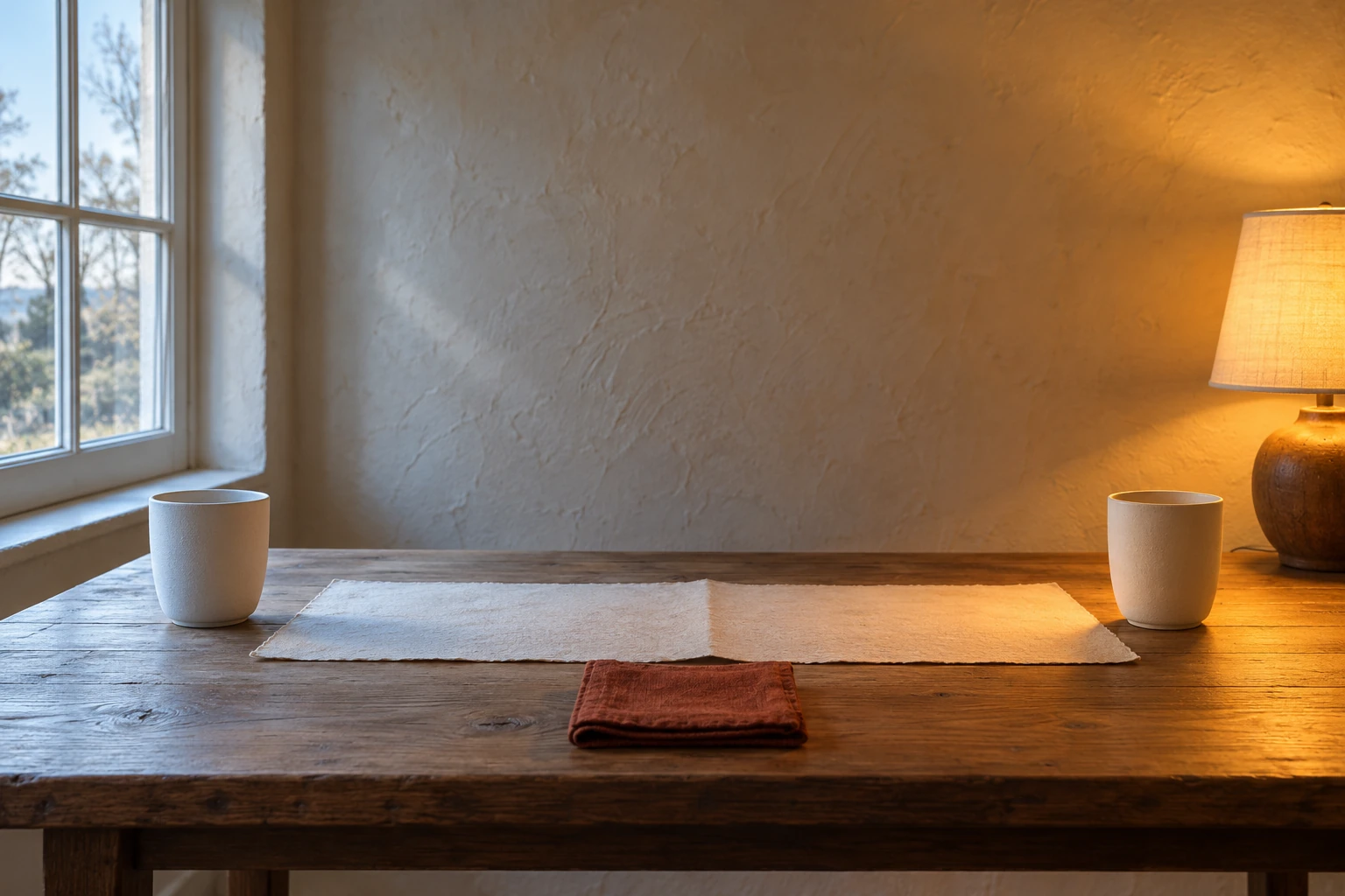
The important observation is spatial: the tint changes with the lighting region. Research on mixed-light white balance treats this as a spatially varying problem because the light color can differ across the picture. That is why a global correction may be a compromise rather than a complete fix. Cornell: user-guided white balance for mixed lighting
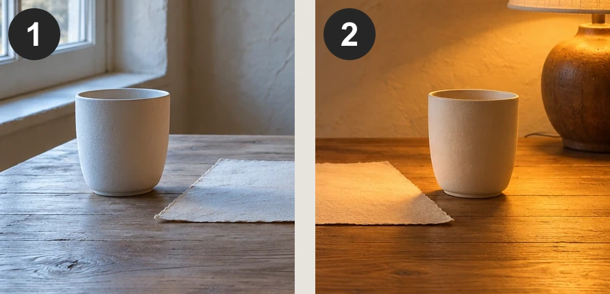
For a generated product scene, choose among three intentions:
- Neutral product presentation: simplify the lighting description so one family of light dominates the product. Keep the ambient room secondary.
- A believable evening room: preserve the lamp's warmth and the cooler window light if the contrast supports the atmosphere.
- A local repair: adjust a selected region, then inspect its transition into the rest of the scene. Do not create a neutral patch with an obvious boundary.
These are editorial choices, not promises about a particular generator. If an AI edit changes the cup shape or linen color while correcting the light, you have gained a new defect. Recheck the product against its reference after every substantial revision.
Use temperature and tint as separate questions
Temperature is commonly used for the warm–cool relationship; tint addresses a green–magenta shift. A scene can be too green without needing to be colder. Adobe's Camera Raw documentation treats these as separate controls and notes that not every remaining cast is a white-balance problem. Adobe: Camera Raw color adjustments
A helpful review order is to settle the broad warm–cool intention first, then inspect for an unwanted green or magenta cast. Keep comparing the same trustworthy region rather than chasing a different “white” object with every move. Judge the colored fabric as well: an acceptable neutral patch alone does not establish acceptable color throughout the image.
There is also a distinction between the temperature of a light source and a camera's white-balance setting used to compensate for that source. Do not turn the familiar warm/cool vocabulary into a universal rule about which direction every numeric slider must move. Read the control in the editor you are actually using.
A Kelvin number in a prompt is not a calibration
In photography, Kelvin expresses a relationship to light-source color; real camera presets provide approximate examples. A number inside a text prompt, however, is a description for the generator to interpret. Unless a specific tool documents a calibrated control, it does not establish a measured lamp temperature or a particular pixel color.
For the mixed-light example, source descriptions and the material to protect communicate more than a pile of camera numbers. A raster export also should not be treated as camera raw data: Adobe distinguishes the approximate temperature adjustment on JPEG/TIFF from the true-temperature scale available for raw files. Adobe: Camera Raw temperature controls
Run one reversible color correction
Use the unmarked first illustration for practice. The goal is the morning editorial defined above. The procedure below is for you to try; this article does not show a measured correction result.
1. Record the evidence before editing
Keep the original. Note the cup body, cream paper, linen and wall separately. Write whether the unwanted warmth appears shared across them or concentrated in one region. Do not start by assigning a Kelvin number: the file does not tell you the temperature of a real lamp.
2. Try one control and compare the whole image
In an editor with temperature and tint controls, make a modest temperature-only trial toward a cooler appearance. Leave tint, saturation, exposure and contrast unchanged for this trial. Compare the same material regions with the original. If ceramic improves but paper loses its cream character or linen no longer reads as rust, reduce or undo the adjustment.
There is no required numerical value. Keeping the original is a valid result if the trial weakens the brief. Adjusting several controls at once makes that judgment harder because you no longer know which decision caused the change.
3. Switch approach when the evidence is local
For the mixed-light scene, repeat the diagnosis on each cup rather than applying the first scene's choice automatically. If cooling the lamp side damages the window side, undo the global trial. Either retain the intended mixed light, simplify the lighting in a new generation, or use a localized correction with a gradual transition. Layer masks can limit where an adjustment appears; they do not decide which region should be neutral. Adobe: layer masks
If using generative editing, the following is a complete alternative practice request. It aims to reduce excessive local warmth while preserving the evening setup; it was not run for this article.
View promptHide prompt
Edit the supplied mixed-light still life.

Reduce the excessive orange cast on the lamp-side ceramic cup and its nearby tabletop. Keep a visible warm influence from the lamp; do not neutralize the entire evening scene. Keep the cooler window-side region and a gradual transition across the paper and table.

Preserve both cups' shapes and positions, the cream paper, rust linen, window, lamp, camera angle, and crop. Preserve material identity while allowing color appearance to respond to the localized lighting change. Do not turn cream paper white, recolor the linen, add objects, or change the scene to daytime.
4. Accept the color change only if its boundaries work
Check the cup contour, paper fold and table around the corrected region. An abrupt color seam, gray halo or unchanged orange ring is a failed transition. Also inspect the objects: a newly reshaped cup is not a successful color correction.
| Result | Decision |
|---|---|
| Useful neutral reference and material differences survive | Keep the candidate, then inspect the actual export. |
| One side improves while the other becomes implausibly blue | Undo and revisit the local-light diagnosis. |
| Paper becomes white only because its actual cream color was removed | Restore the material color or choose another reference. |
| A patch is neutral but its surroundings show a visible boundary | Repair the transition or return to the original. |
Exercise: choose the reference and the scope
Before editing, answer three questions: Which numbered region in the first scene could be used as a tentative reference, and under what assumption? Should both cups in the mixed scene be forced to identical pixel colors? What would make you reject a locally corrected result?
Answer criteria: the ceramic body can be tentative if its intended material is known to be neutral. The generated card is not independent calibration evidence, and the paper is cream. The two cups occupy different light regions, so identical pixels are not a required outcome for the evening brief. Reject a visible mask boundary, changed object geometry, lost paper color, or a correction that destroys the intended light relationship.
Save a short verdict with your candidate: what improved, what stayed trustworthy, and what remains uncertain. The lighting guide helps describe the source; the editing guide helps protect the rest of the image.