Art-Direct an AI Campaign That Holds Together
Build a small visual system, assign each placement a job, and review campaign coherence separately from exact product fidelity.
On this page
A coherent AI campaign needs a small visual system before it needs more images. Keep the message, product identity and a few visual relationships stable; let framing and emphasis change for each placement. Repeating the same crop is only one way to look consistent, and often an unhelpful one.
Imagine a small studio launching a refillable ceramic soap vessel. It needs a square announcement, a wide website image and a vertical social image. The practical question is whether all three communicate the same idea while doing different jobs.
The fictional campaign below is an original teaching example. Its scenes were made with a built-in image-generation tool and then arranged for comparison. They illustrate art-direction decisions, not a test of product-preservation accuracy or a guarantee about any model.
Prepare a brief that another person could execute
Before opening a generator, make one page with the campaign sentence, product references, intended placements and rejection conditions. For our exercise, the audience is someone furnishing a calm bathroom; the offer is a reusable vessel accompanied by a refill. We are communicating that relationship, without making environmental or ingredient claims.
For a real product, start with an approved front view and a side view that explain the pump and silhouette. Add the current label artwork separately. For this fictional concept, the first accepted illustration supplies the visual anchor instead. Mark that difference in the brief: a concept may explore a container; a product advertisement must accurately represent the container being sold.
Keep a blank placement template beside the references. Our horizontal template reserves the left side for two lines of headline, while the object group lives on the right. Draw those regions as simple boxes before generating. This catches a conflicting brief early: a large central product, a long central title and abundant central negative space cannot all occupy the same area.
Start with the sentence the pictures should share
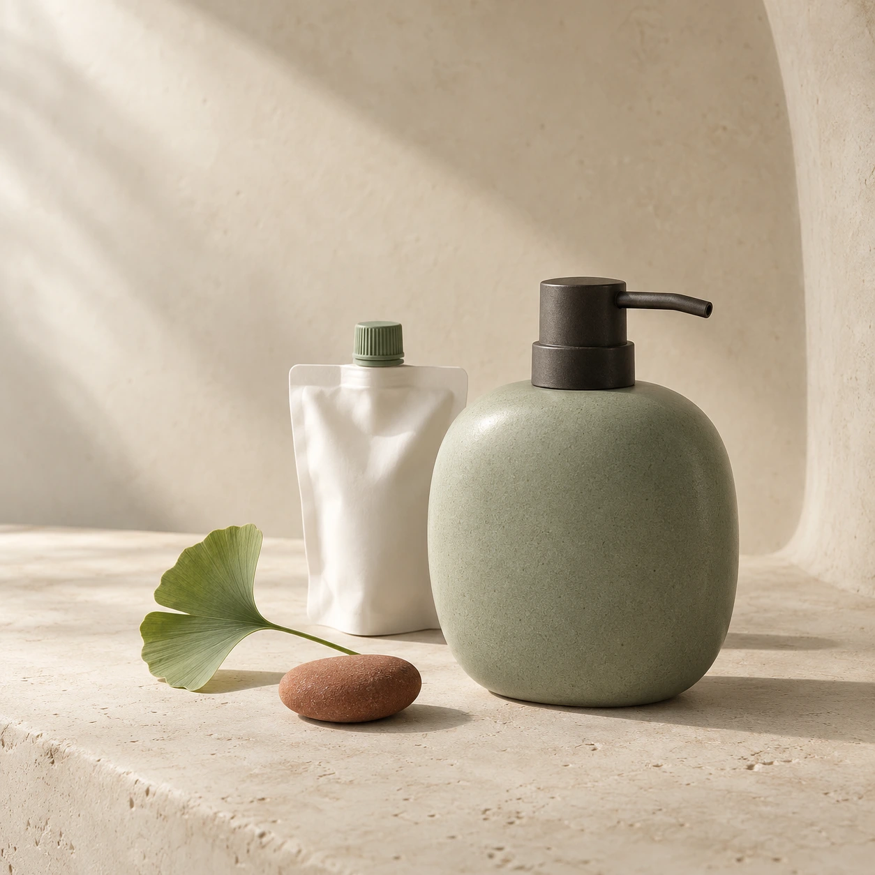
Our campaign sentence is “Keep the vessel. Refill the ritual.” It suggests an object worth keeping and a refill that belongs beside it. A spectacular image of a lone bottle would explain only half of that idea.
Choose the subject relationships before choosing adjectives. Here the vessel is the main subject, the white pouch explains the refill, and a ginkgo leaf adds a restrained botanical cue. The terracotta stone is a supporting accent. If it becomes the brightest, largest object, it may start advertising the prop instead.
Write down what “the same campaign” means in observable terms. Adobe's guidance on brand consistency includes rules for imagery alongside color, typography and other identity elements. That is a useful starting point; the specific choices below are our editorial design system, not Adobe prescriptions. Adobe: maintaining a consistent brand identity
Give each visual element a role
A palette is more useful when it describes responsibilities. “Use sage, cream and terracotta” allows a cream bottle on a terracotta wall. That combination may contain the same colors but tell a different visual story.
| Element | Keep stable in this campaign | Allow to change |
|---|---|---|
| Message | A desirable vessel and its refill belong together | Which one gets more explanation in the copy |
| Color roles | Oat creates space; sage identifies the vessel; terracotta is a small accent | Exact amount of empty background |
| Material | Matte ceramic, pale mineral surface, restrained natural texture | Distance and visible surface detail |
| Shape | Rounded vessel and softly curved surroundings | Object spacing and angle |
| Light | Soft illumination from the left, grounded shadows | Framing and distance, while checking the resulting light |
| Hierarchy | Product first, refill readable, props subordinate | Where the group sits inside the frame |
These are invariants: the conditions that make this particular system recognizable. They are not every detail in the anchor image. The leaf's exact angle is flexible. The existence of the refill is not.
Real product work needs a stricter identity layer. Record the actual pump, silhouette, label, volume markings and permitted colors separately. A mood reference does not authorize an invented cap or a reshaped container. Keep approved product photographs and artwork available for that check.
Assign different jobs to the three placements
Decide the reading task before asking for a different aspect ratio. For this small launch, the roles are:
- Square announcement: make the vessel-and-refill relationship clear without requiring a headline.
- Wide website placement: put the object group to the right and preserve usable space for real text on the left.
- Vertical placement: keep the pump and vessel legible while creating a taller rhythm and quiet space above.
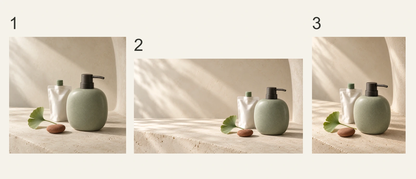
Read across the sheet before studying individual details. The pale environment still dominates. The sage vessel remains the visual anchor. The darker pump is recognizable, and the terracotta accent never takes over. Those relationships survive the changed frame.
Now look more critically: pump proportions and the vessel outline vary slightly between these illustrations. That is acceptable for showing a fictional visual system, but it would require correction before claiming to depict one manufactured product accurately. Campaign coherence and product fidelity are separate approval decisions.
Give a reference one clear responsibility
Use an approved anchor to communicate the chosen system. When supplying a reference, say which parts it owns: the product silhouette, the color roles, the material, the lighting, or the composition. “Make it like this” leaves those responsibilities entangled.
For the wide version, the useful instruction is: retain the recognizable vessel and refill, preserve the soft left light and the color roles, then move the group right to create text space. Asking it to preserve the entire composition while changing to a much wider frame creates competing demands.
Avoid attaching every beautiful inspiration image. One might suggest hard flash, another glossy chrome, another a dark forest. If all are treated as equal instructions, the brief no longer defines a system. Keep the accepted anchor distinct from exploratory references. The multiple-reference guide develops that input-management problem; this article's concern is deciding what those references should preserve.
Work through one family in an explicit order
Our actual production order was square anchor, horizontal variation using that anchor, then portrait variation using the same anchor. Each request returned one candidate. We inspected all three; this small, selected teaching set says nothing about success rates.
First, approve the anchor against the brief. At normal viewing size, identify the first and second things you notice. Then enlarge the pump, vessel edge and pouch cap. A beautiful surface is not sufficient if the second package has disappeared. Save the accepted image separately from exploratory outputs, so a rejected variation cannot silently become the next reference.
Second, change the placement task. The horizontal request kept the visual-system requirements but moved the group into the right third. Here is the complete request actually used with the anchor attached; it describes an intention, not a universally reliable recipe.
View promptHide prompt
Use case: ads-marketing. Input image is the approved visual-system and fictional product reference. Generate one new 16:9 wide editorial product photograph for the same campaign, not a crop of the reference. Preserve the recognisable rounded broad sage ceramic pump vessel with short charcoal right-facing pump, white refill pouch with sage cap, oat limestone, soft diffuse daylight from upper left, fine natural matte texture, muted sage and oat dominance and a very small terracotta accent. Arrange dispenser and white refill together in the right third, small terracotta rounded stone and one ginkgo leaf near their base, quiet generous pale oat negative space in the left half suitable for later HTML headline. Change camera distance and horizontal spacing to fit the banner, retain grounded soft shadows and photographic tactility. Exactly one dispenser and one pouch. No visible text, no labels, no logos, no typography, no frame, no screen mockup, no collage. Luxurious restrained botanical still life.
Third, judge the result before requesting the portrait. In this wide result, the pouch remains identifiable and the left side accommodates the sentence. The portrait request then used the original anchor again, asking for a compact lower grouping and open space above. It did not inherit the wide composition accidentally.
The portrait request also asked for a slightly elevated view. That difference is too subtle in the result to use as a teaching conclusion. We accepted its useful vertical arrangement, not every phrase in its prompt. Inspecting the picture has to overrule what the request says should be there.
Judge the image inside its eventual layout
The contact sheet catches a different kind of failure from the final placement. It reveals a stray palette or an overly dominant prop. The placed composition reveals whether the title fits, the product becomes too small, or a crop removes the refill.
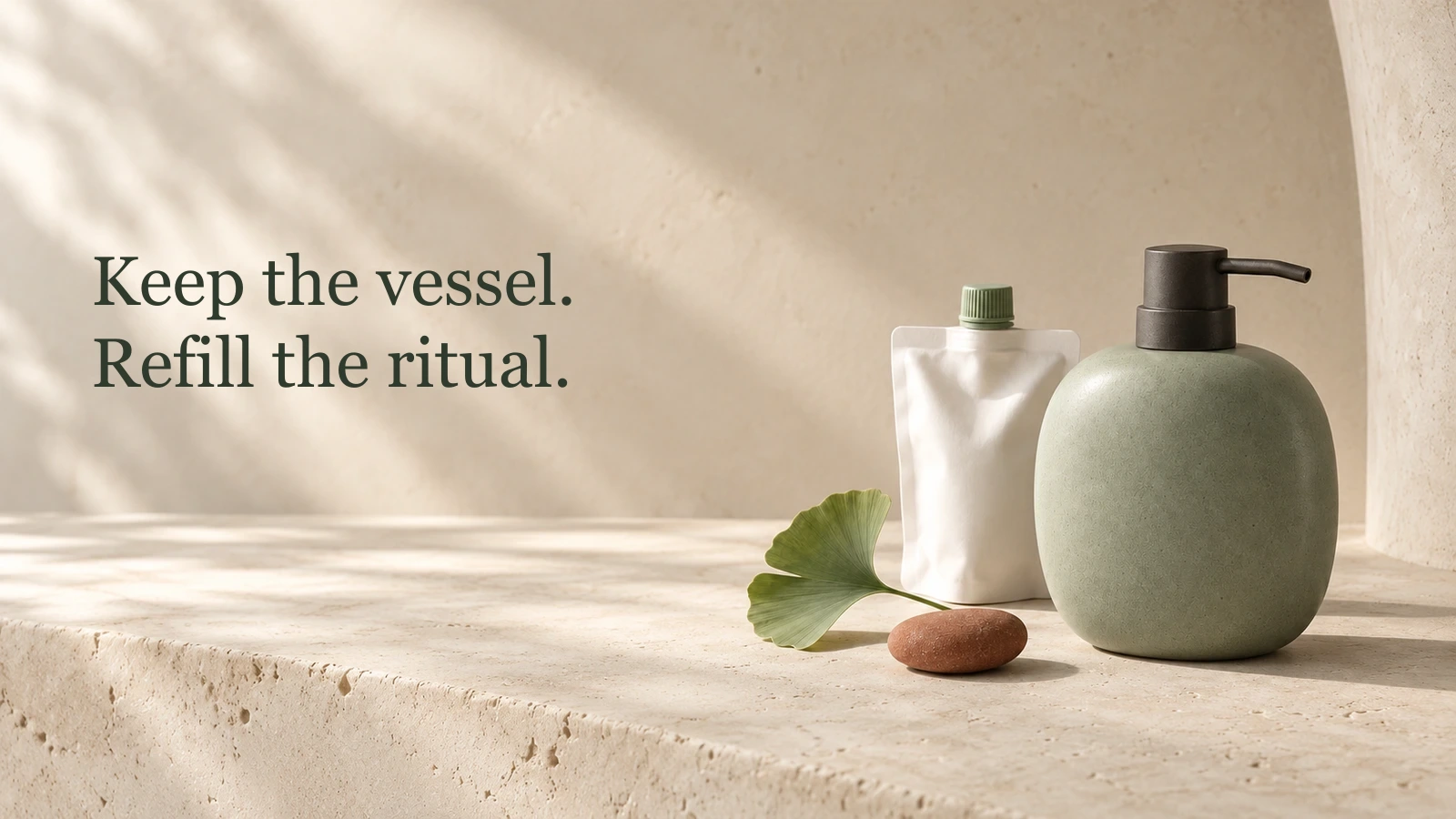
In this example the words occupy the space deliberately left by the image. The headline remains independent of the generated pixels, so it can be corrected, localized and resized without regenerating the vessel. The image is still doing its job when the sentence is removed: two related packages remain visible.
Check the smallest actual placement, not only the full-size export. At a compact width, a product-and-pouch silhouette may survive while fine ceramic texture disappears. That is not automatically a defect: decide which information that placement must carry. If it must communicate “refill,” the pouch cannot become an unrecognizable white sliver.
Do not turn this check into a claim that the campaign will convert better. Visual acceptance can establish readability and coherence in the layouts you inspected. It does not measure audience response.
Repair one failed decision at a time
The following are diagnostic examples, not additional measured outputs. Write the failure in terms of what a viewer cannot understand, then choose the smallest relevant change.
| Observation | Next revision | Keep fixed while reviewing |
|---|---|---|
| The refill merges into the background | Separate the pouch silhouette from the wall or increase its local contrast | Vessel shape, palette roles and light direction |
| The headline crosses the pump | Reposition the group or adjust the text region | The approved product and campaign sentence |
| The scene looks like glossy cosmetics | Restore matte ceramic and diffuse light | Placement and object count |
| The series feels repetitive | Change distance or spacing for one placement | Message, color roles and material |
| The label or pump changes | Return to the approved product reference; reject the inaccurate result | Actual product identity |
Compare the revision with both the failed version and the anchor. If moving the pouch also changes the vessel into glass, the first problem may be fixed while a new one appears. “One condition” describes your requested revision, not proof that the tool changed nothing else.
Practise a fourth placement and explain your choices
Add an email banner to this campaign. It must show the vessel and refill in a shallow horizontal region, with a short heading above the image. Before generating anything, write one allowed change and two things that cannot change.
A defensible answer allows wider spacing or a more distant view, preserves the product-and-refill relationship, and keeps sage assigned to the vessel. It does not squeeze the portrait image until the bottle becomes wider. If the small format makes both packages illegible, revise the layout or the placement's job before spending time on texture.
Now assess two proposed variations: one changes the leaf angle; another changes the ceramic vessel to transparent glass. Under our brief, the leaf angle is flexible. The glass vessel fails both the material rule and product identity. A different campaign could make other decisions; the exercise tests whether your verdict follows the stated brief.
Make approval specific enough to repeat
Before generating the next variant, give the reviewer a short acceptance brief:
- State the one message and the placement's job.
- List the product details that may not change.
- Describe color roles, material and light rather than a pile of style adjectives.
- Name what may change: crop, angle, spacing or emphasis.
- Reserve real space for copy and test with the actual words.
- Review both the family and each final placement; reject failures against the brief, even when an individual image is attractive.
When a picture feels unrelated, revise the condition that drifted. A blue background does not need a longer prompt about elegance; it needs the agreed background role restored. When the system feels rigid, loosen a flexible dimension such as distance or spacing before replacing the palette, lighting and material all at once.
The useful handoff is an anchor, a small set of rules and approved placement examples. Another person should be able to explain why a new image belongs to the campaign—and which visible change would make it stop belonging.
Deliver the original images, final crops or layouts, editable text, the brief and a short change note together. Mark unresolved identity issues explicitly rather than letting a handsome contact sheet imply approval. For this teaching set, the remaining boundary is deliberate: coherent fictional concept art has been demonstrated; an exact commercial-product depiction has not.